Anthony PerreaultAnthony Perreault is a senior at New Mexico Tech, majoring in Technical Communication with an emphasis in computer science and web design. While taking classes, Anthony also works full-time at the National Radio Astronomy Observatory's Pete V. Domenici Science Operations Center as an operations specialist for the Very Long Baseline Array radio telescope where part of his duties include maintaining and upgrading operational documentation. Anthony worked with Dr. Julie Dyke Ford on his senior thesis project, Analysis of Web Content Delivered to a Mobile Computing Environment.
ContentsBackground of Wireless Technology Selection of Sites for Analysis |
NYTimes.com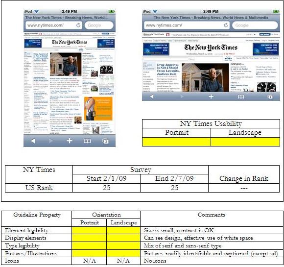 The mobile user can still access the NY Times website, and will be greeted with what can argued as information overload. Again, while there is some organization with the display elements—I can clearly see what appears to be a menu on the left hand side, areas of content separated by white space, and several images with, I hope, associated text (other than for the possible ad in orange about two-thirds of the way down the right hand side)—there is a lot of information being thrown at the user that can’t be readily identified without magnification. Even in landscape orientation the site isn’t much better. I can make out that there is a navigation menu on the left side (breaking the canard of 7±2 menu items) and the headline of the top article. It almost looks like the designers of the nytimes.com site took the five-column layout of the paper and translated it directly to the web without consideration of the difference in the medium. Without significant magnification, the site isn’t usable, and then the user is faced with the spatial disorientation that is inherent with mobile devices. |
Pages: 1· 2· 3· 4· 5· 6· 7· 8· 9· 10· 11· 12· 13· 14· 15· 16· 17· 18· 19