"Analysis of Web Content Delivered to a Mobile Computing Environment"
Anthony PerreaultAnthony Perreault is a senior at New Mexico Tech, majoring in Technical Communication with an emphasis in computer science and web design. While taking classes, Anthony also works full-time at the National Radio Astronomy Observatory's Pete V. Domenici Science Operations Center as an operations specialist for the Very Long Baseline Array radio telescope where part of his duties include maintaining and upgrading operational documentation. Anthony worked with Dr. Julie Dyke Ford on his senior thesis project, Analysis of Web Content Delivered to a Mobile Computing Environment.
ContentsBackground of Wireless Technology Selection of Sites for Analysis |
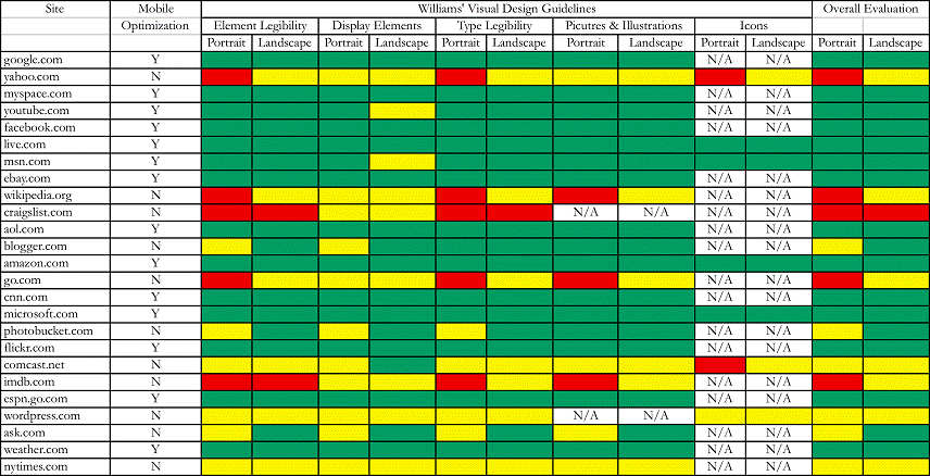
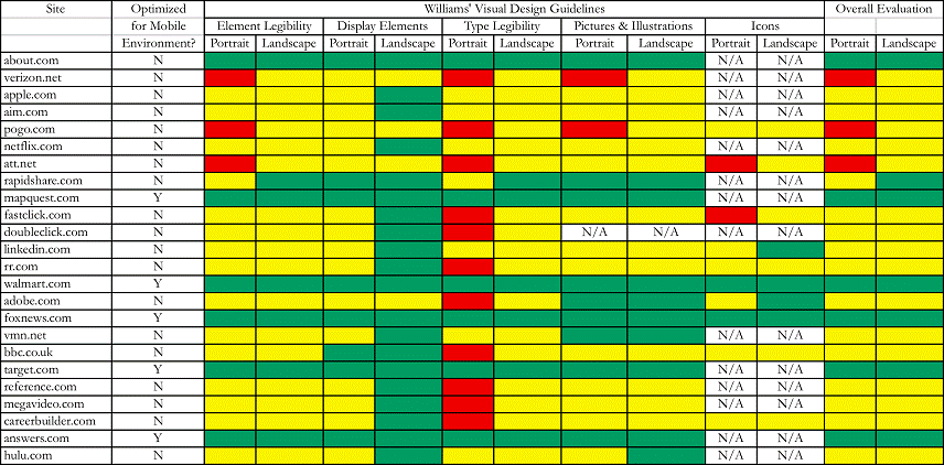
Analysis of SitesWilliams' Visual GuidelinesWeb sites, even those that contain primarily text, provide content through a visual medium. Therefore, any analysis of web sites should be through established guidelines on how to best present the visual content of web sites. In his 1999 article, Williams established a series of visual guidelines that can be used to analyze how well web sites display their visual information within the mobile computing display. Williams’ visual guidelines provide a baseline by which I was able to analyze the selected sites from the survey on the iPod Touch. The visual guidelines that Williams presents are principles of good web design and should be applied when designing and analyzing content for the mobile environment where the visual component is far more consequential for navigation and understanding the context of the site. My analysis is qualitative in nature, based upon my experience in visiting the sites in a mobile environment—the library at New Mexico Tech was selected because it has a strong Wi-Fi signal. Williams’ guidelines are divided into six categories. Of these six, five will be used to analyze the selected sites. The five guidelines that will be used are: element legibility, designing display elements, type legibility, pictures and illustrations, and icons. The sixth guideline, animation, will not be used due to the fact that few mobile computing devices support animation outside of games. The iPod Touch does not support the Adobe Flash format that is the standard for delivering rich animated content and video files on the Internet. The site hulu.com, for example, will load on the iPod Touch but the video content will not stream because the Flash format is unsupported. Williams elaborates on his guidelines as follows: Element legibility: size and contrast. For an element to be legible—“capable of being both apprehended and deciphered”(393)—it has to be large enough to be clearly seen as well as being able to tell what the elements are. For example, can the elements that make up a navigation bar be easily identified? Is the navigation bar itself identifiable? Do the visual elements have sufficient separation from the background or do they blend into the background because it is too busy? Designing display elements: information structure, grouping, relative importance, consistency and predictability, and sequence. All of these elements can be grouped into the nomenclature of PARC: proximity, alignment, repetition, and contrast, although Williams moves contrast into the first guideline of element legibility. Elements of the display need to reflect a “pattern of logical or functional relationships”(393). Like items should be grouped together or identified by the use of white space. Similar elements or a group of elements should be organized through the use of “color, position, size, isolation, complexity, and tonal contrast”(394), have a consistent use of design elements, and have them in some form of order or sequence. Type legibility: typeface choice, type size, bold and italic, all caps, alignment, line length, leading, paragraph boundaries, and headings. Is the typeface sans serif and large enough to be easily read? Avoid overuse of bold and italicized words. Don’t use all capitals letters, for “(W)ord shapes provide significant clues to the reader as to their identity”(394). Use flush-left ragged-right alignment for extended reading, keep line length between 40 and 60 characters, and have extra space (leading) between lines of type—“typically between 50 and 100 percent of the type size”(394). Paragraphs should be marked by boundaries of white space for visual chunking of data. Headings and subheadings should be used to organize and identify relationships and hierarchy. Pictures and illustrations: decorative, supplemental text, information structure, and appearance and perceptual qualities. Pictures and illustrations should reinforce content; therefore avoid the use of pictures and illustrations for decoration. Provide supplemental text to ensure that the picture or illustration is interpreted correctly. Pictures should be used to “reveal the structure or organization of things or ideas—particularly when the structure is not linear”(394). Lastly, photos and illustrations should be used to show how something looks or to “depict a perceptual quality such as color, texture, pattern, shape, relative size, spatial location, orientation, arrangement, or appearance”(394). Icons: labels, familiarity, and “global” differences. Icons should be labeled and conventional icons “whose use and meaning the user is already likely to be familiar with”(394) should be used such as the home icon to go to the home page of the site, an envelope for an email link, and a question mark for further help. Icons should be designed to be similar to each other in style and color, yet significantly different from other visual elements on the site in order to call attention to themselves as some unique element of the site. Results of Analysis of Selected SitesTable 4, which follows the detailed analysis of the selected sites from the survey, presents the analysis of all 49 sites of the survey. For each of the five guidelines—element legibility, design elements, type legibility, pictures and illustrations, and icons—I assigned a color value of green, yellow, or red. Green means that I was able to easily identify visual elements such as navigation, search, login and password fields; that the overall design was coherent, had a structure and understandable; that I could easily read the text on the display; pictures and illustrations were easily visible and understandable within the context of the content; and the use of icons were clear. Yellow means degradation in viewing the elements that could be corrected by using the magnification capacity of the iPod Touch to expand the site in the display. Red means that the site is unusable without significant magnification, which leads to a loss of navigational awareness of where you are on the site. The increased magnification means that additional scrolling in both vertical and horizontal axes is needed to navigate around the page. 
 For each guideline there is also a Portrait and Landscape orientation qualifier. The iPod Touch has the ability to display a web site in either portrait orientation (320 pixels horizontally by 480 pixels vertically) or landscape orientation (480 pixels horizontally by 320 pixels vertically). I selected the portrait orientation as my default in that the majority of web sites are designed along the vertical axis rather than horizontal. Another reason for selecting portrait orientation as the default is that some sites, when detecting mobile browsers, will alter the content to be displayed in a single vertical column thus limiting the scrolling to only vertical. There are also web sites that will accept a URL and reorganize the content into a single vertical column that will then be sent to the mobile browser. Google has a subdirectory at www.google.com/gwt/n that will perform this function and a web site called Bare Site (www.baresite.com) will also reformat content from a given URL for mobile browsers. The landscape orientation on the iPod Touch has the added benefit of magnifying the displayed site by 50% due to the number of pixels changing from 320 to 480. The drawback is that the display is now wider than it is vertical, resulting in the possibility of having to perform more scrolling on the vertical axis in order to get to desired information. When translated from portrait to landscape orientation most sites increased in usability to some extent. Some sites like the mobile site for Walmart, however, became marginally less usable; these sites are optimized for a portrait-oriented browser display and the content breaks down when the orientation is in landscape. In the selected sites that I analyzed, I went no deeper into the site that the initial or home, page, which appears when the site is loaded into the browser. Because of the varied nature of the sites that I visited, there would be far too much diversity to draw any kind of coherent conclusion had I gone deeper into the sites beyond the home page. I had two options available for the site survey: a broad survey that looked at a lot of different types of sites but by necessity was shallow in that only the home page would be analyzed, or a narrow survey that looked only at a few sites but went deep into the site beyond the home page. I opted for the broad but shallow survey in order to look at as many sites as possible, across multiple genres, and sites that were optimized for the mobile environment. |
Pages: 1· 2· 3· 4· 5· 6· 7· 8· 9· 10· 11· 12· 13· 14· 15· 16· 17· 18· 19