"Analysis of Web Content Delivered to a Mobile Computing Environment"
Anthony PerreaultAnthony Perreault is a senior at New Mexico Tech, majoring in Technical Communication with an emphasis in computer science and web design. While taking classes, Anthony also works full-time at the National Radio Astronomy Observatory's Pete V. Domenici Science Operations Center as an operations specialist for the Very Long Baseline Array radio telescope where part of his duties include maintaining and upgrading operational documentation. Anthony worked with Dr. Julie Dyke Ford on his senior thesis project, Analysis of Web Content Delivered to a Mobile Computing Environment.
ContentsBackground of Wireless Technology Selection of Sites for Analysis |
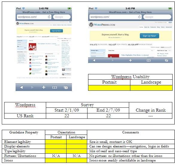
Wordpress.com Wordpress is both a blog hosting site and a provider of open source blogging software. Unlike Wikipedia, though, in portrait orientation I can at least make out the structural design of the site. (Virtually all sites got green reviews for the display elements in both orientations.) I can tell that there is a navigation menu on the upper right side above the pale yellow box with the "Sign Up Now!” button that is nicely contrasting. I can tell that the light blue box on the left hand side is probably a username and password login fields. I can even tell that there is content on the right side in the form of blue words that are probably links, and content in the middle with icons of some form. In landscape orientation a good chunk of the content is below the bottom of the screen, resulting in the need to scroll. The navigation is larger but still a little hard to read without further magnification. The "Sign Up Now!" button is clearly visible and easy to read, as is the content directly below the pale box with the number of bloggers, posts, and words. It is quite possible that the blogs themselves might be easy to view, or they may be impossible to access for the mobile user. |
Pages: 1· 2· 3· 4· 5· 6· 7· 8· 9· 10· 11· 12· 13· 14· 15· 16· 17· 18· 19