"User Experiences of Spanish-Speaking Latinos with the Frontier Behavioral Health Website"
Download PDF About the AuthorRaquel L. Dean holds a B.A. in Psychology and a M.A. in English with an emphasis in Rhetoric and Technical Communication from Eastern Washington University. She currently works for Kalispell Regional Healthcare as a School-based Mental Health Worker and plans to obtain her Ph.D. in Clinical Psychology in the near future. Her research interests lie in both psychology and technical communication, with topics including: minority mental health, child psychopathology (childhood trauma and anxiety disorders) and evaluating barriers among minorities when accessing and receiving mental health care, by facilitating usability tests to examine information design and observe the users' experience. Contents |
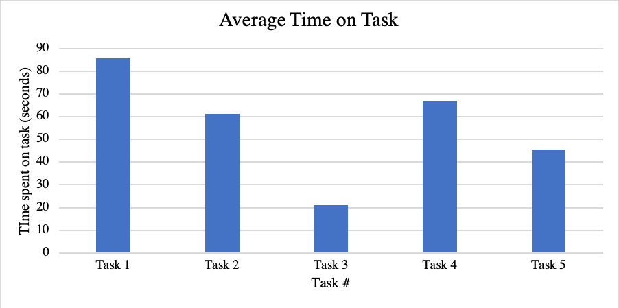
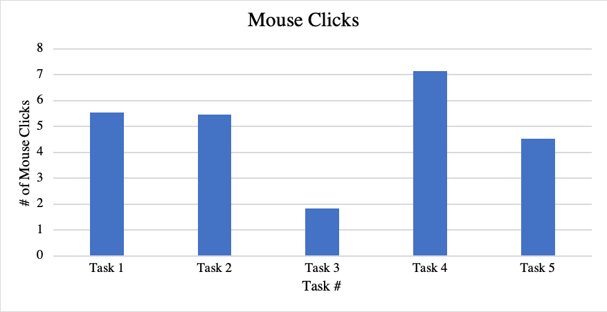
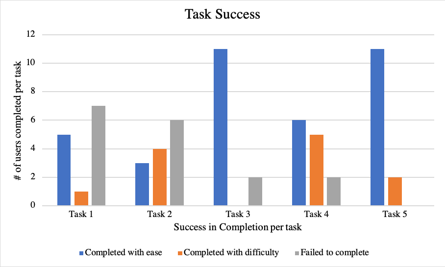
ResultsIn this section, I will be presenting data collected from the pre-test survey, usability test, and the post-interview. The data collected was used to address the research question: how do Spanish-speaking Latinos navigate information on the Frontier Behavioral health website? In this section, I will solely present data collected from the study, and then follow into the discussion, where I will provide an interpretation of this data. The results of this study point to a few issues with the user’s experience in navigating the website with ease. These issues are not a reflection of the user’s ability to explore a website but point to a larger issue related to the design, which negatively affected these users’ experiences. To begin, I will review the demographic information relevant to this study, which was collected through the pre-test survey. Although I created these user profiles, I was mainly able to gather individuals from the college student profile, due to limitations (no responses from other user groups). As mentioned before, due to difficulties recruiting Spanish-speaking Latinos who were willing/had the time to participate in the study, the majority of the participants were currently enrolled students at EWU. DemographicsOf the total of 13 (n=13) participants, the youngest is 21 years old and the oldest participant is 31 years old. All participants graduated and received at least a high school education. The participants fell in the following categories: five with “some college,” one with an Associate Degree, five with a bachelor’s Degree, and one with a master’s Degree. Moreover. Individuals are Eastern Washington University (EWU) alumni and are all working full-time. The remaining ten individuals are current students at EWU and fall into the following categories: four full-time, three part-time, and three are unemployed but remain full-time students. Out of all thirteen participants, when ranking their proficiency in speaking, writing, and reading in Spanish, one participant claimed to be on a basic level, ten claimed to be on an intermediate level, and two participants claimed to be on an expert level. When ranking their proficiency in speaking, writing, and reading in English, zero claimed to be on a basic level, four participants claimed to be intermediate, and nine claimed to be on an expert level. Regarding their technological experience and skill level, the average (mean) rating [basic knowledge, intermediate (practical application), or expert] was 2.43. All 13 participants responded that they have access to a laptop, computer, or tablet. When assessing how familiar the users are in using a computer, tablet, or laptop, they chose a number based on the Likert scale: where one represented not at all familiar, five indicted extremely familiar. The average (mean) rating was 4.86. This meant that almost all participants rate themselves as being “extremely familiar” when using a computer, tablet, or laptop. There was a following question that asked about their comfort level in navigating the internet to search for important information. They were asked to rate themselves based on a Likert scale, rating of one through five, poor to excellent. The average (mean) answer to this question was 4.86. Again, this showed that almost all participants rated themselves as having “excellent” comfort levels with being able to access information through internet exploration. All participants were asked how much time (hours) they spend a day using technology. The available options were: less than an hour, 1-2 hours, 2-3 hours, 3-4 hours, or 5 or more hours. All participants answered that they spend 5 or more hours a day using some type of technology device. All participants had internet access at home. This was no surprise due to the fact that a large portion of these participants are actively enrolled university students, who have been exposed to and participated in a lifestyle that revolves around the constant use of technology (computers, cell-phones, tablets, laptops) in order to access needed information. Information was described as any research topics or questions they wanted to learn more about. Results: Time on TaskBy providing these results on how long it took each user to complete a task, I was able to identify which task(s) took the least amount of time to complete, as well as the longest. Through this data, I was able to carefully see which factors contributed to these outcomes, which shed light on their overall experience. Figure 1 highlights the average time (seconds) it took for all (n=13) users to complete tasks 1-5. When measuring these tasks, I began the “task time start” when the user began scrolling and moving the mouse, to navigate the website. The task ended when the user located the information and verbally announced that they had “found it” or “were done.” If they did not verbally state so, I would ask the user if they had completed their task or if they were going to continue searching. The average (mean) amount of time spent on each task, in seconds, are as follows: task one (different types of services provided to youth/children) (85.66), task two had the least average of time spent on task of 4.66 seconds (finding the closest FBH facility and directions to that facility) (61.32), task three (steps to follow to begin accessing MHS) (21.12), task four had the highest average of time spent on task with 288.33 seconds (locating resources to read, regarding common mental health disorders) (67.05), and task five (finding the different methods of payment accepted by FBH) (45.42).  Figure 1: Time on Task Results: Mouse ClicksPresenting the results of the amount of mouse clicks it took per user provided me with the opportunity to compare the factors that may have influenced multiple clicks versus just a few clicks. For example, if there was a task that had taken a long time to complete with a high number of mouse clicks, I would begin to analyze why this was happening and if it was negatively affecting the user’s experience. Figure 2 demonstrates the average number of mouse clicks performed per task, for all participants (n=13). This data was set to measure the amount of time the user clicked on their mouse, whether it was to click to move around on the page or to select a hyperlink. The average (mean) amount of mouse clicks, per task, are as follows: task one (5.54), task two (5.46), task three (1.85), task four (7.15), and task five (4.54). This data shows that on average, task four (locating resources to read, regarding common mental health disorders) had the highest amount of mouse clicks, and task three (steps to follow to begin accessing MHS) had the least amount of mouse clicks. For task one (different types of services provided to youth/children), task two (finding the closest FBH facility and directions to that facility), and task three (steps to follow to begin accessing MHS), the minimum amount of mouse clicks was zero because those participants chose to stay on the homepage and did not navigate elsewhere to complete the given tasks. The maximum amount of mouse clicks was 19 for both task one (different types of services provided to youth/children) and task four (locating resources to read, regarding common mental health disorders).  Figure 2: Mouse Clicks Results: Task SuccessThe data also shows the level of success achieved on behalf of all users (n=13), per task (see Figure 3). Task success was assessed based on the level of difficulty the user experienced, while completing each task. They were assessed based on three levels: completed with ease, completed with difficulty, or failed to complete. For example, this data shows that zero participants failed to complete task five. Data also shows that task three (steps to follow to begin accessing MHS) and task five (finding the different methods of payment accepted by FBH) were the easiest to complete, with 11 of 13 participants falling under that category. The task that was most difficult and had the highest amount of task failure, was task one (different types of services provided to youth/children), with 7 out of 13 participants were category.  Figure 3: Measuring the Task Completion and Level of Difficulty Additionally, in Table 4, I provide data that shows the percent of all users (n=13), who were assessed under the three categories of level of difficulty in completing each task. This data shows the average percent of users who were able to complete (or failed) each task and at what level of difficulty. For example, for task one (different types of services provided to youth/children), 38.46% of the total 13 participants completed the task with ease. But task one also has the highest number of users who failed to complete the task with 53.85% of all users falling under this category. This table demonstrates that task three (steps to follow to begin accessing MHS) and task five (finding the different methods of payment accepted by FBH) were overall the “easiest” task to complete, with 84.62% of all users being able to successfully complete the task with “ease.”
Table 4: Average User Task Success (%) Results: Number of errors made, and error level assessedLastly, I present Table 5, which highlights the different types of errors made, per task, among all user’s total (n=13). In regard to assessment, the catastrophic level errors were the ones where the user cannot complete the task, can complete the process but express extreme irritation at the process, or needs significant assistance. Serious level errors are when the user is frustrated but gets through it—suggesting that others may be less inclined to put up with the inconvenience or that frustration related to that task. And finally, the cosmetic (minor) level errors are when the user may hesitate or pick the wrong option, but the user is able to correct it without incident, or if the user express minor irritation or annoyance, but it doesn’t affect their ability to complete the task at hand. In total, for the entire study, there were four cosmetic errors, four serious errors, and ten catastrophic errors. Task one was the leading cause of catastrophic level errors, with five of the total of ten errors made in that category. Task three had the highest amount of serious errors, with three of the total four errors made in that category. And task two had the highest amount of cosmetic errors made, with three of the four total errors made in that category.
Table 5: Error Level Per Task There were various factors that contributed to the users having a frustrating and confusing experience when interacting with the Frontier Behavioral Health website. We will now transition to the findings, where I will review and interpret the results. |
Pages: 1· 2· 3· 4· 5· 6· 7· 8· 9· 10· 11· 12· 13· 14· 15· 16