"User Experiences of Spanish-Speaking Latinos with the Frontier Behavioral Health Website"
Download PDF About the AuthorRaquel L. Dean holds a B.A. in Psychology and a M.A. in English with an emphasis in Rhetoric and Technical Communication from Eastern Washington University. She currently works for Kalispell Regional Healthcare as a School-based Mental Health Worker and plans to obtain her Ph.D. in Clinical Psychology in the near future. Her research interests lie in both psychology and technical communication, with topics including: minority mental health, child psychopathology (childhood trauma and anxiety disorders) and evaluating barriers among minorities when accessing and receiving mental health care, by facilitating usability tests to examine information design and observe the users' experience. Contents |
Findings and DiscussionWhen examining the results of this study, I looked at usability and the user experience to gather a deeper understanding of what had happened. Usability is what allows users to accomplish these series of tasks to accomplish one goal with ease. Studying usability allows us to see if the users were able to utilize the product effectively and efficiently when having this interaction with the website. The user experience is valuable because it provides you with an insight into what factors contributed to their positive or negative experience, as well as evaluating whether or not the user was able to have a satisfying and meaningful experience during this interaction. Before reviewing my findings and providing my interpretation, I would like to look back at MEELS, which will help explain the findings:
In this section I analyze data to interpret the various factors that influenced task failure, errors made (cosmetic, serious, catastrophic), why they were made, and patterns observed among all users during the usability testing project. In this section, I also analyze errors made during this study that were due to the design of the website, not because of the users’ abilities, experience, or intelligence levels. There were three levels of error: (1) catastrophic, (2) serious, (3) cosmetic. While I review these errors, I will expand on the user’s experiences during the most difficult tasks and some common patterns observed among the users. There were five catastrophic errors made for task one (locating the services provided, specifically for youth/children). For task one (different types of services provided to youth/children), the users struggled to learn how to navigate the website, due to its homepage design and were forced to utilize the information on the homepage to complete their task (see Figure 4). This was a failed task due to the users coming face to face with barriers that did not allow them to easily access information about what services FHB provides to youth/children in the Spokane county. The scenario they were provided for the test stated that they were on the website in the first place to receive mental health services for their eight-year-old son. The website's mistake of not placing the menu in a visible area presented a navigation and accessibility issue to users. Therefore, the users were unable to see the full list of services provided that their theoretical child would be able to access. Task one took the longest amount of time to complete, with an average of 85.66 seconds to complete. Task 1 also had the highest number of clicks out of all tasks, with an average of 5.54 clicks (highest of 19, lowest of 0). Task one had a 46.15% completion rate (ease and with difficulty) and a 53.85% failure rate, which was quite significant. The users were observed experiencing difficulty in learning the website and were still unfamiliar with navigating efficiently to locate information. There was a total of six errors made for this task: one cosmetic, five catastrophic. When looking at all of the data for task one, there was a significant issue with learnability. There was also an issue with efficiency. The users were not able to find information they wanted in a timely manner. Because users were not familiar with the website, they struggled and spent the largest amount of time on this task, and unfortunately some users even gave up. Right on the first task, I began to note that users were becoming frustrated with the lack of a visible menu or search bar to make their navigation process easier and more efficient. 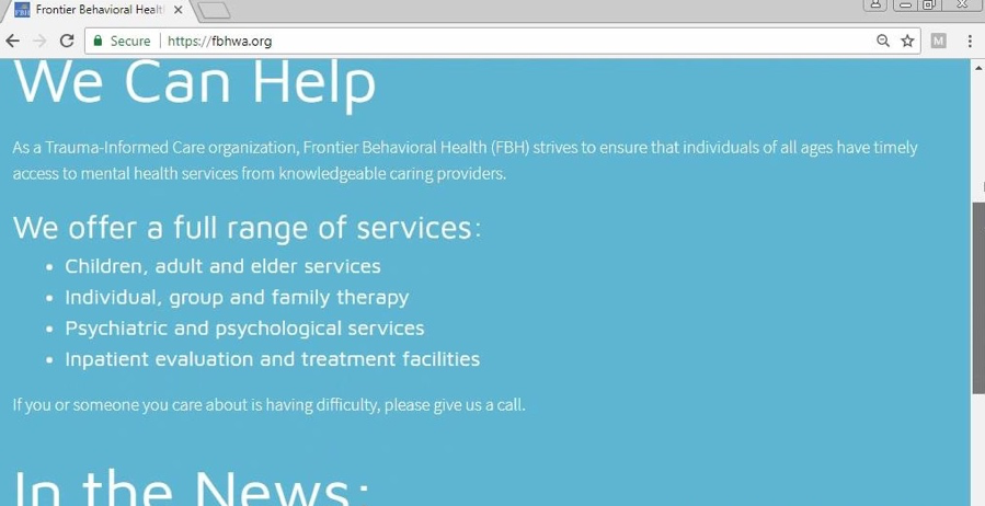 Figure 4: Frontier Behavioral Health Full Range of Services on homepage Additionally, five users were unaware there was a menu button at the top of the homepage, and one user became frustrated and gave up on the task because he was unable to locate the information. Users were struggling to locate the "Menu" link because it was so small and all the way at the top (see Figure 5). This design decision began causing issues for the users and created an unsatisfying experience. Participant five discovered the menu button by task three (steps to follow to begin accessing MHS), stating: “Is this the full menu? [pointing to the top of homepage with cursor]. Look at that … the menu has directions! Clearly I wasn’t navigating this website fully [laughs at self].” Participant six, who was aware that the menu button existed but became frustrated, expressed his internet browsing process: “My instincts are to go to the menu, to find something like ‘types of services…There’s a lot of text… which I’m not going to read. As a user, I’m trying to scan. But I can’t read any headers or keywords.” As the user continued to explore the website, he became visually frustrated and confused, so the user went back to the homepage to see if they could find the information they were looking for. After a few minutes of searching, the user exclaimed: “I don’t see a button that says ‘youth services’ or ‘children.' I’m pretty much confused and … I give up.” The participants who were unable to complete the task were marked as “failed to complete” and were assessed at a catastrophic level of error, due to two primary reasons. First, the services provided towards the bottom of the homepage are the general services provided to children, adults, and the elderly. This was an honest mistake because that information is not labeled in a way that directly says, “General services provided” or “Services provided to youth.” The users were confused about the language used on the homepage and were unsure where to navigate on the website. Second, the users continued to struggle to find a way to navigate outside of the homepage and because of the visibility issue of the menu link. The menu link forms into a drop-down menu (see Figure 6) to locate the services that Frontier Behavioral Health specifically provides for youth/children. The scenario provided at the beginning of the usability test emphasized that their sole reason to explore the website was to find valuable information that would lead to receiving mental health services for their son. If this were a real-life scenario, the user would begin to get frustrated or would be misinformed, both of which would not be their fault, but the result of a design issue. Task one also had one cosmetic error made (locating the services provided, specifically for youth/children). Participant 9 was unable to complete the task and was assessed at a cosmetic error level type for task one. This user clicked on “Programs,” under the main drop-down menu, and then read off the general services provided by FBH, instead of searching for the services provided to children/youth specifically. Again, if this user’s experience reflected a real-life situation, and the user was a mother of an eight-year old, who is currently in crisis, they would want to receive the accurate information needed to learn about the different types of services that are provided to children/youth. That way, they can assess which service(s) they needed and which they would request in order to best serve their child’s needs. 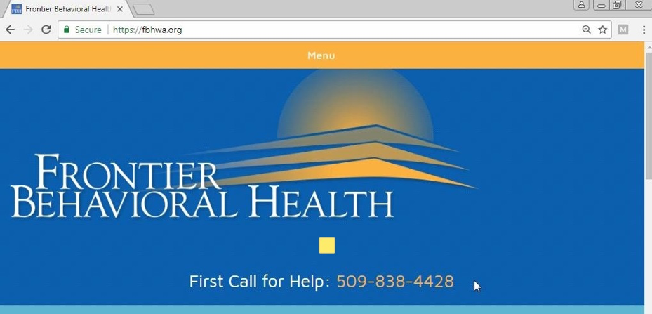 Figure 5: Frontier Behavioral Health ‘menu’ link on homepage 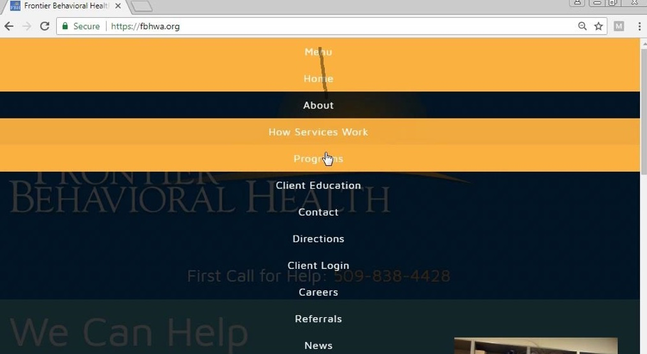 Figure 6: Frontier Behavioral Health ‘drop-down menu’ on homepage During task two (locate the nearest FBH facility to your current location and access directions to that location, for future reference), users continued to struggle to complete the given task. There were three users who looked up multiple locations instead of focusing on finding the closest one to their current location. On average, users spent 61.32 seconds to complete the task. There were three users who took a significant amount of time to complete. User 8 spent 114.86 seconds to complete this task, user 9 took 152.54 seconds to complete, and user 12 took 109.35 seconds to complete. These users took longer than anticipated, due to the confusion of where to navigate to complete their task. Two of these users navigated over to the correct page but were unable to investigate which facility was closest to their current location and were unable to access directions to that facility. Again, the learnability issue came about. They took a long time because they were attempting to become familiar with the website and become more comfortable with the navigation of the website but were unable to. But then there was one user who spent 4.66 seconds to complete the task. This user spent the least amount of time because they stayed on the homepage and did not navigate the website. This pointed to the learnability issue observed in task one. Individuals were still struggling to get the hang of how to efficiently and effectively navigate the website to locate specific information. During task two, there was no significant difference in mouse clicks, with an average of 5.46 clicks made during the completion of this task (highest 16, lowest of 0). There was also a 53.85% completion rate and a 46.15% failure rate. But most significantly, there were a total of nine errors marked for this task: three cosmetic, three serious, and three catastrophic errors made. These errors occurred for two main reasons: (1) the user was confused on the difference between the “contact” and “directions” pages (both pages had the list of all the facilities in Spokane county, but the user was unclear on which facility was closest to their current location), and (2) the user did not navigate past the homepage. At this point, users were observed getting progressively frustrated as they struggled to learn how to efficiently and effectively navigate the website and where to go to locate specific information. All three of these participants failed to complete this task, due to being unable to move past the homepage to locate the “Directions” tab under the drop-down menu. Instead, all three participants named the main facility (see Figure 7) as the nearest facility. This posed a real-life issue because users did not have an idea on where they would need to go to find the nearest facility to them and then access directions to that facility for their convenience. These errors continued to be tied back to users struggling to locate the “Menu” link located at the top of the homepage. Task two (locate the nearest FBH facility to your current location and access directions to that location, for future reference) had three cosmetic errors. Participants two and four were able to complete the tasks, but with some difficulty. Both participants were assessed at a cosmetic level error for the completion of task two. Participant two was able to find the FBH facility that was the closest to them but was unable to access directions to that facility. Comparatively, participant four was able to locate the closest facility, but again, did not actually access the directions to that facility as asked. Participant four stated: “I would say this is how I would be able to look at it… depending where I’m at, I could put the zip code,” as the user was pointing to the “Search Locations” bar on the page with their mouse cursor (see Figure 9). As for the serious level errors, participant 10 was unable to complete the task and was assessed at a serious level error. Participant 10 stated: “I would click programs. And I would put…I would look at all the services that they have on here, like adult services, recovery treatment…is that it? [I responded that I could not directly provide a yes/no answer and they should utilize their best judgment] I’m going to say yes.” This particular participant was observed wanting to find the most effective and efficient way of completing each task but was still unsure on whether or not the information was correct. At task three (steps needed to take in order to begin accessing/receiving mental health services from FBH) learnability, efficiency, and memorability significantly improved for at this point in the study. On average, task three was completed in 21.12 seconds. This was the fastest completion time for all tasks. Showing more efficiency in completing the tasks. There was also an average of 1.85 mouse clicks, which was the lowest of all five tasks. For this task, there was only a 15.38% failure rate and only one error made (catastrophic). The data points that by this point, the users had gained more confidence in themselves and were able to navigate through the website with a bit more ease. The users began spending time more efficiently due to increased memorability. The users began utilizing the drop-down menu, which helped them navigate more efficiently. Users at the point were familiar with navigating the system. The one error that was made was due to one user who still faced the barrier the design posed—which was being unable to see the menu link. At this point I began noting the pattern, among a series of participants, who were unable to clearly see the labeled “Menu” link, and thereby, were unable to use a drop-down menu on the homepage. Instead, these users were forced to complete the task by locating information to complete task three on the main page. Participant 3 stated: “It says first call for help… so I guess, first call for help,” inferring that they would call the first Call for Help hotline number in order to begin receiving mental health services (see Figure 7). This was a task failure at catastrophic level for two reasons. The first could not locate the menu because it was not visible to them, which pointed to a major design error. The second reason was because the First call for Help number is a crisis hotline number, for individuals who may be in crisis and are in need of immediate psychiatric or medical assistance. But there was no subtitle or caption that explained this to users, who may be unfamiliar with this crisis hotline. The users that were able to complete this task successfully and locate the information needed were able to find the lists of steps needed to take in order to begin accessing mental health services under the “How Services Work” link under the menu (see Figure 6). 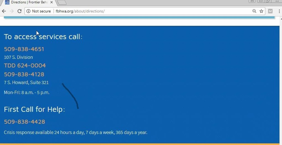 Figure 7: Frontier Behavioral Health Primary Contact Information on homepage For task four (locating resources to read on the website regarding mental health and common mental health disorders), there was one catastrophic error made. Participant 12 was unable to locate resources to read regarding mental health services on the Frontier Behavioral Health website, because of the continued visibility issue with the menu. These resources can be located by clicking the “Client Education” link on the main drop-down menu (refer to Figure 6). The user stated: “I would say under ‘programs,’ because it tells you what you’re looking for…” The user expressed confusion and hesitation, which ultimately led to task failure. Task two (locate the nearest FBH facility to your current location and access directions to that location, for future reference) had three errors and task four (locating resources to read, on the website, regarding mental health and common mental health disorders) had one error, with a total of four serious level errors made overall. Regarding task two (closest facility and directions), both participants 7, 12, and 13 were assessed at a serious error level. All three participants were unable to complete the task. Participant seven was able to find the different FBH locations in Spokane County under “Contact,” from the drop-down menu (see Figure 8) but was unable to access the directions themselves. This participant was unable to access directions or see which facility was closest because they were unsure about which page they were supposed to navigate over to (“Directions” tab under menu). Instead, participant 7 navigated under “contact,” scanned the list of locations, and then randomly picked from the list and stated: “I would say Frontier Behavioral Health on S. Division, Spokane.” Similarly, participant 12 and 13 navigated to “Contact,” as well, scrolled down the list of various locations, and picked a location at random. Participant 12 stated: “I just don't know much of Spokane, so I don’t know which is close.” Then participant 12 went on to say: “okay, I’ll just say this one [pointing with the cursor to the first address on the list].” Both participants failed to complete the task. What the users were unaware of was that the website has two different pages where a user can see a list of locations. The problem with this is that one page has a list of locations, but the other has a list of locations and the ability to download directions to the closest facility. But there’s no clear way for a user to be able to distinguish the difference between these two pages and which they would navigate to in this situation. 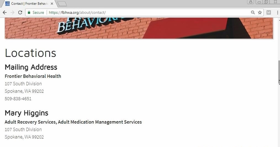 Figure 8: Locations list under ‘Contact’ of the Frontier Behavioral Health Website 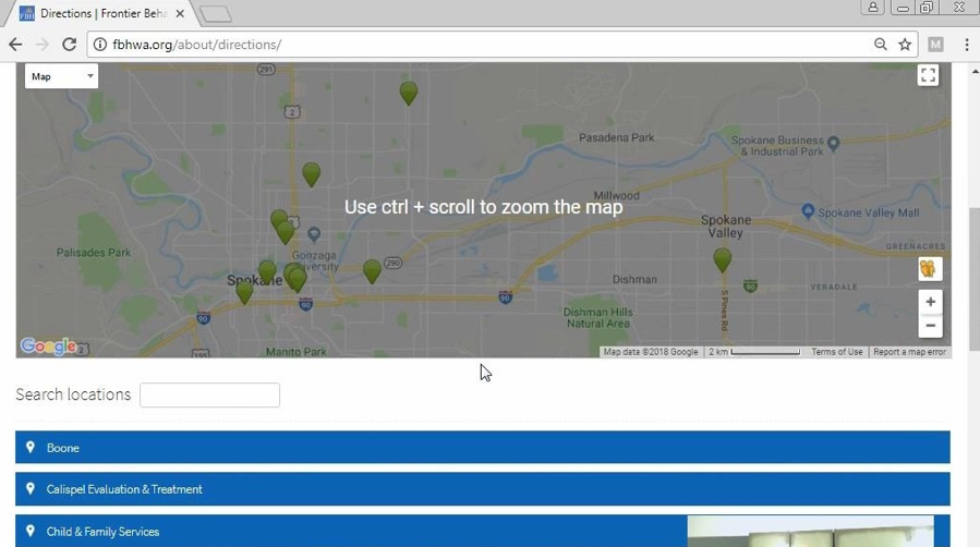 Figure 9: Directions page of the Frontier Behavioral Health website Continuing with task four (locating resources to read, on the website, regarding mental health and common mental health disorders), users were observed to be improving in memorability and learnability. On average, users spent 67.05 seconds completing each task. For task four, users jumped to having an average of 7.15 mouse clicks. Specifically, there were five users who clicked on the high range (10 to 19 clicks). Fortunately, the failure rate was low with 15.38% and a total of two errors: one serious, one catastrophic. Although most users were able to complete it, users were observed experiencing difficulty because they were not offered a search bar, so they may locate information with keywords. There were memorability and learnability issues because their learning system had not prepared them for this task for two reasons: (1) it was not efficient because they spent longer times completing this task, and (2) they were unable to connect keywords to the available menu options. Finally, by task five (finding the different methods of payment accepted by FBH), users had become more familiar with efficient ways of navigating the website and were more confident being able to find accurate information. On average, users spent 45.42 seconds to complete this task and 4.54 mouse clicks (second lowest out of all five tasks). Most importantly, there were no errors made. Not only did the users improve significantly in learnability, memorability, and efficiency by the end of the study, but by the end, it became error resistant. It was error resistant in the sense that users were completing the tasks in a more efficient and effective way. But users who struggled or took a bit longer were still unfamiliar or uncomfortable with their experience. Due to their previous issues with navigating the site, some still doubted they were on the right track or were unsure. In essence, the majority of the user experience issues were due to the design of content on the homepage—mainly, the lack of visibility of the menu button caused serious navigation and usability issues. The way that the Frontier Behavioral Health website has been designed made it difficult for the users to see and utilize, thereby negatively affecting accessibility to information on the rest of the website. The website also lacked a search bar, which would make the user's experience significantly easier with regard to locating specific information by using keywords or terms. Participant six expressed that from what they knew about websites, they could use the search bar. This user’s previous experience had showed them that they could navigate and explore more efficiently with a search bar. This user quickly noticed there wasn’t one and stated, “I don’t see a search thing, so I’ll try the menu. I’m looking for ‘resources,” when attempting to complete task four, which they did with some difficulty. Similarly, participant one stated: “I’m trying to look for something that says like ‘learn about’ or ‘how to understand; but I’m not seeing anything,” when referring to completing task four, which the user did with some difficulty. This supported the general thought process of the participants scanning for keywords, phrases, and the lack of the search bar made it difficult for them to locate specific information. It was very difficult for users to accomplish basic tasks the first time they encountered the Frontier Behavioral Health website. This is where a few users were unable to move past the homepage because they were unaware of the menu button, to fully explore the site. There was also a memorability issue, when users were struggling to remember and learn the system and how to effectively use this site. Fortunately, by the third task, all users were observed to be improving using the system of the FBH website and were becoming more efficient in their navigating process. This was supported by the fifth task, which was the fastest to complete out of all tasks with the least amount of mouse clicks. By the fifth task, it had become error resistant. The fifth task was achieved by all users without error, revealing no barriers in accessing information with ease and efficiency. |
Pages: 1· 2· 3· 4· 5· 6· 7· 8· 9· 10· 11· 12· 13· 14· 15· 16