"Contextualizing Place as Type: Creating an Auburn Typeface"
<
|
Harry LewisHarry Lewis is earning his degree in the Masters in Technical and Professional Communication program at Auburn University. His interests include visual rhetoric, typography, and the intersections of marketing and tech comm. Before attending Auburn, he received his BA from Saginaw Valley State University (MI). He is currently searching for jobs in marketing or UX, and enjoys dogs, hockey, and bad jokes. ContentsThe State of Location in Composition Typography as Rhetorical Argumentation |
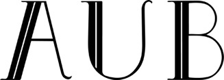
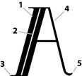
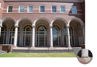
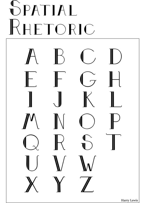
The Typeface & DesignFollowing my analysis of the material and spiritual rhetoric of Auburn, I developed the typeface that follows (Figure 2): Figure 2 I’ve chosen A, U, and B for demonstration purposes not only because of its usage as a common abbreviation for Auburn, but because it provides examples of three noticeably different letterforms. Analysis of the letterforms shows how various elements of the University are rationalized into a cohesive design logic, and how design choices allow me to achieve my design goals in creating a typographic representation of the university. 1) Stem (Figure 3) – the stem is indicative of the columns on campus, and serves as a representation of the physical structures of the University (Figure 4). The left side of the letter was chosen for the materiality of campus, as it aids a reader’s eye moving across the page naturally from left to right. Figure 3 2) Accent Line – the accent line serves two purposes: it divides the stem into two columns, as there is an abundance of them at Auburn, but it also provides a visualization of the spirit of the campus firmly rooted within the material confines. The two are inextricably linked together, identifiable from one another, yet they cannot survive without the other. Figure 4: Arches and pillars as found at the Shelby Center for Engineering, on Auburn University's campus. Columns inspired the weight of the typeface's thick stems. 3) Serifs – a serif typeface was chosen over a sans serif design, as it not only reinforces the representation of the columns mentioned previously, but it provides a planted stance, lending strength and grounding. 4) Organic Side – the right side of the design is representative of the student body, both current and past. The thickness of the line was chosen to embody the strength of the Auburn traditions and family, while not being a distraction from the thicker material side on the left. The left-to-right transition of thick to thin weighting aids in guiding the reader’s eye across the page. 5) Fluid Serif (Figure 5) – the right serif design is different from the left, to further represent the bifurcation of the material and organic sides of the University. The serif is reminiscent of a tiger’s tail, as Auburn’s athletics teams are known as the Tigers, but the subtle flick is also representative of the student body’s eventual departure from the University, while remaining an integral part of the school’s developing traditions and history. Figure 5 The full set of uppercase letters is included below (Figure 6). Figure 6
|


