Xchanges >> Issue 6.1>> Analysis of Web Content Delivered to a Mobile Computing Environment
Analysis of Web Content Delivered to a Mobile Computing Environment
Anthony Perreault
Abstract
The purpose of my research was to analyze web content delivered to the mobile computing environment with two goals in mind: first, to determine if the content lost contextual relevance in the mobile environment and, second, to see if a set of effective design principles could be applied towards the mobile environment. My research combines a literature review in conjunction with a survey that encompasses both quantitative and qualitative methods to analyze top-rated web sites in the mobile environment. Results from my literature review suggested that in the technical communication field there has been no research into the mobile environment since 2000, while in the engineering field there has been current research into how best to display content on a mobile computing device. Findings from the survey showed that some content did lose contextual relevance in that it was unusable without magnification. Once a page is magnified beyond a certain point there is a loss of navigational awareness within the site visited. Content that was designed and optimized for the mobile environment, however, maintained this contextual relevance. Given that close to half of the 49 web sites that I surveyed were designed for the mobile computing environment, it is obvious that a set of guidelines either existed or could be derived and applied to websites targeted for the mobile environment. I present these guidelines in the conclusion of my research.
Introduction
According to the Telecommunications section of the United States Census Bureau’s 2008 Statistical Abstract, in 2006—the last year listed—there were over 233 million cellular telephone subscribers. Given that even the most basic cellular telephone can receive information from the Internet, this figure translates to 233 million plus people that can use their cell phones as mobile computing devices.
Due to the physical limitations of mobile computing devices—memory, CPU processing power, connectivity speed and signal quality, and perhaps most significantly screen display size—technical communicators face different challenges in designing Internet content for this medium as opposed to more traditional web content bound to a desktop or laptop computer. Mobile computing devices—cellular telephones (from the basic units through smartphones), Internet-capable Personal Data Assistances (PDAs), and PocketPCs—require technical communicators to rethink the presentation of content to these devices.
In delivering content to mobile computing devices, sacrifices must be made due to the nature of the mobility of the user. The user is not in a static environment that is controlled (air temperature, humidity, and lighting) with an optimized computer system that has a fast Internet connection. The user of a mobile computing device is often in an uncontrolled environment, on the move, and subject to changeable signal quality as they travel; even within the confines of a large city, signal quality can degrade, resulting in a delay in getting information on the mobile computing device.
The needs of the user in the mobile computing environment are also different than the needs of the user in the static environment. Very often the mobile user is looking for a specific piece of information, such as the location of a restaurant or travel directions. The mobile user is not idly surfing the Internet, gathering bits and pieces of information; they want a specific bit of information immediately, if not sooner.
My research questions, therefore, hinge on how content is delivered and displayed on mobile computing devices. It is reasonable to ask what sacrifices need to be made to the content when delivering it to a mobile computing device. How should technical communicators, who often are designers of web content, go about designing for this medium? Is there an optimal way to deliver content to a mobile computing device? Is the context of the content shifted when being delivered to a mobile computing device, with its small display, as opposed to the same or similar content delivered to a laptop computer?
To answer these questions I will begin this article by examining the technological means of how content is delivered to mobile computing devices. I will present, through a literature review, why and how designing content for mobile computing devices requires different strategies than for more traditional computer platforms. I will then present an analysis of several web sites that were viewed on a mobile computing device. I will discuss how the sites either pass or fail visual design through the use of Williams’ visual design guidelines. Finally, in the conclusion, I will present guidelines for technical communicators when designing web content for the mobile environment.
Background of Wireless Technology
The basis of wireless technology is radio communication. Whether it be your home wireless network, the wireless local area network at your work or college, or the network of cellular towers that allow continuous communication across the United States, at heart they all share similar technology of radio frequency (RF) communication. This section will briefly explore how wireless communication—from your Bluetooth headset to the wireless mobile computing device—operates.
In the United States the governing body for public and private broadcast communication is the Federal Communications Commission (FCC). Besides monitoring content that is broadcast over the airwaves, the FCC is responsible for the allocation of radio frequencies used in private and public transmissions. The FCC licenses portions of the radio spectrum for use to companies such as Verizon, Sprint, AT&T, T-Mobile and other cellular telephone providers. Other areas of the radio spectrum are licensed out to radio stations and broadcast television. Selected frequencies of the radio spectrum are reserved for police, ambulance, and other emergency use. Still other frequency ranges are reserved for the military, air traffic control, and scientific use, primarily radio astronomy.
The FCC has set aside radio frequencies that the public can access, through the use of low-power radio transmitters and receivers, without the need of a license. In this realm lie the wireless personal area network (WPAN) and the wireless local area network (WLAN). Because the range of the radio transmissions is limited to usually under a hundred meters, the FCC does not require a license. This open area of the radio spectrum has led to an explosion of wireless devices such as Bluetooth headsets, keyboards and computer mice. And wireless Internet access points, more commonly known as Wi-Fi hot spots, have resulted in the ability to access the Internet through your Wi-Fi enabled laptop or mobile computing device.
Wireless Networks: Bluetooth, WPAN, WLAN, and WWAN
Perhaps the best known and used wireless network, beyond the cellular telephone, is the home-based wireless network that connects computers and printers to a wireless router, which itself is linked to the Internet through a high-speed connection such as cable, DSL, or satellite. This home network allows computers in different rooms to communicate with each other to transfer files, such as audio or streaming video downloaded from the Internet. It also allows various computers with disparate operating systems to share resources, such as the Internet connector or a printer, without the need for physical cables or reconfiguration of software.
Home networks, or WPAN (Wireless Personal Area Networks), come in two types: Bluetooth and IEEE 802.11 (Mallick 48). What makes Bluetooth technology both convenient and useful is that it is very much plug-and-play. Bluetooth devices will automatically configure themselves, according to Franklin and Layton, creating localized networks called piconets that can be shared by up to eight Bluetooth-enabled devices.
The Institute of Electrical and Electronic Engineers (IEEE) designates specifications for electronic devices and unlicensed communication protocols (Mallick 52). One such set of communication specifications is IEEE 802.11, more commonly known as Wi-Fi and by Apple users as Airport and Airport Extreme. This specification is used in both the home and office environments to create WLANs—wireless local area networks. The 802.11 specification is broken down into subsets with an alphabetic suffix; this suffix represents when this particular subset was first proposed (Mallick 57). Many laptop computers now come standard with both Wi-Fi (802.11) cards as well as Bluetooth for devices such as wireless keyboards and mice.
The 802.11 specification subset that has seen the largest commercial penetration is 802.11b, or as it is more commonly known, Wi-Fi (Mallick 57). With its extended range and data transmission, 802.11b is useful in the office environment or college campus.
The WWAN—wireless wide area network—is the realm of cellular telephony. This cell—or area of coverage—of a tower is determined by network protocol, signal power, and obstructions that may block the signal; cell coverage is anywhere from 1 to 40 kilometers in range (Mallick 66). In populated areas where there are more calls to handle, microcells are established that can handle this increased volume of data (Mallick 67). When on a cell phone and moving between cells, the process of transferring the signal between cells is called a handoff or a handover; missed handoffs result in what is known as a dropped call and, depending on the network protocol used, the connection might have to be re-established by the user of the phone (Mallick 67).
WWANs have evolved over the course of the years. While the history of how the cellular networks came about and the evolution of the network protocols are beyond the scope of this article, it should be recognized that in the United States there exists two basic networks, 2G (second generation) and 3G (third generation). Virtually all cellular telephones on the market in the US today operate as 2G devices with basic data services such as email and instant messaging. In populated areas 3G networks provide increased data bandwidth. This increased bandwidth allows the mobile user to have an “always-on” data connection to the Internet through their cell phone; examples of these cell phones are Apple’s iPhone or the newest generation of the RIM Blackberry.
Wireless Application Protocol (WAP) and Wireless Markup Language (WML)
Wireless Application Protocol (WAP) is the method by which wireless information is delivered and presented to mobile phones and other wireless devices. WAP uses Wireless Markup Language (WML), which is a subset of Extensible Markup Language (XML), to format the content delivered to the microbrowser that resides as an application on the mobile phone. Most low-end mobile phones use WAP and WML to send and receive text messages (SMS—Short Message Service), emails, and very basic Internet service (Mallick 117).
WAP is similar to Hypertext Transmission Protocol (HTTP) in that WAP, like HTTP, is the method by which the information and the formatting instructions—WML for WAP, HTML/XHTML for HTTP—are carried. The technical communicator should know is that WAP is another method by which content is delivered to the low-end mobile phones and how to code for this environment.
WML is part of the wireless application environment and is based off XML (Mallick 311). WML is based on a deck and card metaphor; a WML page is a deck that is created from a series of cards. When the deck is accessed by the microbrowser, all cards for the deck are downloaded to the phone where all the interaction takes place with no further need to access the content provider until a new deck is requested (Mallick 313; Moll 44). Because many of the low-end mobile phone screens are around 150 x 150 pixels, the amount of information that can appear on them is limited to around five lines with around 12 characters per line (Mallick 312). With such a limited display, the information presented has to be exactly what the user is looking for and navigation has to be as easy as possible. Interaction with the WML deck and cards is through the keypad of the phone; options should be as few as possible and use the least amount of keystrokes. The microbrowsers also have minimal navigational commands such as Submit, Back, Link, and More (Mallick 312).
Because WML is based on XML, the rules for XML formatting must be followed. Part of this formatting includes using the WAPForum Document Type Definition (DTD) in the WML code to identify the document as a WAP / WML document type (Mallick 312). Likewise, the following XML rules need to be followed when coding for WML (Mallick 313):
- Elements must be closed.
- Elements must be properly nested.
- Documents must be well-formed.
- Element tag names must be in lowercase.
It is beyond the scope of this paper to provide details on how to design and code for WML and XML. There are many exceptional books on the subject of XML and w3schools.com provides excellent online introductions and tutorials to WAP, WML, and XML.
As mobile computing devices have become more powerful, the browser application likewise has evolved from the microbrowser to what is now commonly known as the minibrowser. The minibrowser is capable of rendering and interpreting HTML / XHTML / HTML-MP / XHTML Basic as well as running Javascript. The minibrowser is rapidly bringing the desktop web experience to the mobile computing device.
HTML / XHTML / HTML-MP / XHTML Basic
The last several generations of smart phones and mobile computing devices have browsers that are capable of interpreting Hypertext Markup Language (HTML), Extensible Hypertext Markup Language (XHTML), and Extensible Hypertext Markup Language-Mobile Profile (XHTML-MP) (Mallick 316-23).
HTML is the markup language that formats content for web pages. It is a loose standard in that tags do not have to be closed in order for the browser to interpret the formatting commands, and that tags also are not case sensitive; it is fairly common to see tags such as <p> without a closing tag or tags with different cases such as <p> and </P>.
XHTML combines elements of XML with HTML. As such, XHMTL code is far stricter in how it is formatted than HTML, which leads to better coding practices. XHTML documents have to conform to XML syntax rules (Mallick 321):
- Documents have to be well-formed.
- Elements have to be properly nested.
- Tags and attributes must be in lowercase.
- Elements have to be closed. Empty elements are closed with a closing slash "/".
- Attribute values must be enclosed in quotations.
- DOCTYPE declaration is required.
One of the advantages of using XHTML is the support for cascading style sheets (CSS) to control document appearance.
XHTML-MP is a subset of XHTML Basic that is recognized by W3C that is designed for mobile browsers. XHTML Basic is, according to W3C’s website, a “document type [that] includes the minimal set of modules required to be an XHTML Host Language document type…It is designed for Web clients that do not support the full set of XHTML features; for example, Web clients such as mobile phones, PDAs, pagers, and settop boxes.” XHTML Basic can be thought of as the minimal amount of modules that is needed to make and support XHTML documents for desktop and laptop browsers, as well as being modular in design so that additional modules, such as the Mobile Profile, can be added to target specific browsers. Note that XHTML Basic is designed from the start to be used by mobile phones and PDAs without any additional modules; the inclusion of the Mobile Profile module increases the functionality of the mobile browser (Mallick 323).
Literature Review
With a basic understanding of the technology behind wireless communication in place, a literature review will now be conducted to look at the state of designing content for the mobile environment. The proliferation of mobile computing devices has presented the technical communicator with new challenges in providing coherent content for the mobile user. While the medium for the technical communicator has not changed, the canvas of the mobile computing device is far smaller. The information has to be concise and laser bright to burn through the clutter. Plus, the technical communicator has to be aware of how the software of the mobile computing device might alter the content, and thus the context, of the information. But the role of the technical communicator remains the same: to design the information to effectively communicate the context of the idea to the user.
This literature review explores research performed by technical communicators and engineers concerning how to best present content on mobile computing devices. Technical communicators are concerned with the design of information rather than technological/engineering methods on how the information is displayed. Engineers, according to Dr. McCoy from Star Trek: The Motion Picture, “Love to tinker with things;” their methods are how to alter how the information is displayed via hardware and/or software means. I have organized this review into two sections: the design of information and engineering methods. Both are important when it comes to discussing how to display content on mobile computing devices; engineers and technical communicators should know how content is best displayed for ease of communication, and technical communicators should be aware of innovations by engineers in altering how content is displayed.
Please note that while the research performed by Michael Albers and Loel Kim was focused specifically on a Personal Digital Assistant (PDA) such as the Palm PDA, the scope of this literature review and my research will be that of mobile computing devices that are Internet-capable. Mobile computing devices include, but are not limited to: traditional PDAs, “smart phones” such as the RIM Blackberry, Apple iPhone, and Google’s Android, other cellular telephones that have the capability to connect to the Internet, and other devices such as Apple’s iPod Touch.
Technical Communication Field
The first in-depth qualitative look into displaying information from the Internet onto mobile computing devices was performed by Michael Albers and Loel Kim in 2002. Albers and Kim focus on how a user interacts with a Personal Digital Assistant (PDA), assigning the role of the PDA as a task-oriented device. They provide examples to support the PDA as a task-oriented device: the use of PDAs by military personnel in the U.S. Navy, by medical doctors (45), and by auto-parts salespersons (47). In order to be a task-oriented device, the primary function of a PDA, according to Albers and Kim, is as a data storage device. The secondary function of a PDA is to be able to access information from and place information on the Internet “allowing many individual users to access a common body of information and contribute to or modify it” (47). Chu, who is cited by Albers and Kim, also provides a real-world example of an insurance company that provides its field agents with PDAs in order to download policy manuals and process insurance claims online from the field (53).
The main problem with the PDA is the small size of the display screen and its resolution as compared to desktop displays (Albers and Kim, 50; Chu 53-4). Albers and Kim report on studies that show users spend more time scrolling to find information on a PDA. Due to the size of the smaller display, not as much information can be shown, necessitating vertical and/or horizontal scrolling in order to find information (55).
For technical communicators, the guidelines for the design of content and navigation for Web sites were formulated in the mid- to late-1990s. Articles by Farkas and Farkas, Spyridakis, and Williams provide a comprehensive set of guidelines for the development and organization of content (Spyridakis), the design of the content (Williams), and web site navigation (Farkas and Farkas).
Spyridakis’s article is concerned with how to organize the content of web pages. The guidelines that Spyridakis presents are by now fairly well known within the technical communication community. Minimize the amount of text on a page and group like information together; “readers organize information in LTM (Long-Term Memory) in a hierarchical fashion…Chunking or grouping information items facilitates the reader in building these LTM frameworks”(365). Paragraphs should be written with the conclusion first; “readers perform better with a deductive organization—with topic sentences appearing at the beginning of paragraphs”(366).
Web content should be written so that the pages are scannable through the use of bulleted lists, heading/subheadings, white space, and, according to Jakob Nielsen (whom Spyridakis cites throughout the article) the use of bold fonts to highlight keywords in the text. Spyridakis disagrees with Nielsen’s suggestion of highlighting text to create scannable text. Highlighted text, according to Spyridakis “constantly pull the reader out of the syntax of the sentence and interrupt the reader’s processing of the overall meaning”(367). Spyridakis suggests the use of “good style principles”(368) such as bulleted lists, keywords, headings/subheads, and white space. Finally, writers should write concisely with easy to understand words; “authors should focus on clarity and principles of good technical writing—in this case the use of concise language, clear topic sentences, explicitly stated relationships, logically ordered information, and short pages”(371).
William’s article deals with the effective display of the content after it is organized. As an analogy, while Spyridakis is concerned with the mechanics of a car, Williams cares about the paint job, chrome trim, and the bobbing-head dachshund on the rear dash. Like the guidelines that Spyridakis provides, the ones that Williams presents are also well known to the technical communication community. Display elements should be legible and easily interpreted; “Legibility, therefore, should be a primary consideration of any graphic element in a display”(383) and “an even more practical consideration is whether or not an object on the screen can be interpreted once it’s noticed”(384). Seeing the display element isn’t enough, the user has to also understand the context of the element. Visual elements on the screen should reflect the organization structure of the information; “Good design reveals structure when it visually mimics the logical relationships that exists among elements in a display”(385). Humans look for visual clues to help understand the organization of information. Even if you can’t read, looking at a table of contents reveals that the book has some form of organization and structure.
Williams disavows us of the canard that people read more slowly on screens; “the basic finding that people, do, indeed read more slowly from monitors appears to be disappearing as the quality of text displayed on screens improves”(388). Williams explains the use of sans serif fonts over serif fonts. Serif fonts “may display irregularly when they fall on the boundaries between pixels”(389) and that “(serifs can) appear blocky and disproportionately large, especially when displayed in small type sizes or on low-resolution screens”(389). Williams also presents now commonly known guidelines concerning font size and style, justification, and the use of headings/subheadings to display visual relationship among text elements.
According to Williams, images should be supplemented with text or labels. Images should be used to reveal structure or organization that is non-linear in nature, and be used to “show what something looks like or to depict a ‘perceptual quality’”(391). He also addresses the use of icons; “...icons, because they are pictorial, are almost invariably easy to interpret” (392). Williams is quick to point out that icons within a page should be sufficiently different from the icons used by the browser. Using the same Home icon in a web page that the browser uses, for example, could lead to user confusion: does the Home icon in the web page take the user to the Home page of the site or does it send them to the Home page that they have set as their default launching point? Williams also states that “conventional” icons should be used, such as an envelope for email, in that they are “uniformly and consistently interpreted”(392).
Farkas and Farkas’s article presents rules for effective web site navigation. This article starts off with hypertext theory, the idea that “chunks of Web content (roughly corresponding to individual Web pages) can be understood as nodes and that we navigate from node to node via electronic pathways called links”(341). The Farkases then present the four major ways that nodes are linked: hierarchical, linear and multipath, web, and matrix (342). The guidelines for effective web navigation are also broken down into four major categories: how to design an effective link, how to manage a large number of links, orientation information to tell the user where they are and where they can go, and augmentation of “link-to-link navigation”(352).
An effective link is one that the user knows is a link, “the user must know ‘what’s hot and what’s not’”(342). Identifying a link can be done through various means such as underlining or changing the color of a text link, or the use of graphical links (buttons or icons). Links can be lost if the user has to vertically scroll in order to see them. Links should be clear on their destination to avoid user confusion and frustration. As for organization of links, the Farkases favor breadth over depth in navigation. “The burden of having to negotiate more levels of depth is worse than scanning a longer list of links”(345). Secondary links—shortcuts to nodes deeper within a site—can supplement primary links of the site, providing users with immediate access to content deeper within the web site. The navigational interface should represent the underlying structure of information. “Whatever design choices are made, the goals should be to provide navigational freedom and to enable the user to build a conceptual map of the nodes and links”(348).
Orientation information, according to the Farkases, is “what the user needs to know is the name of the site, the general purpose, and the sponsor”(350). This information should be clearly visible on the home page of the site, but it doesn’t “need to be explicitly stated”(350). As an example the Farkases use Steinway, the famous piano maker. Only the “corporate name in its familiar logotype (the visual representation of “Steinway”)”(350) is needed to understand what the web site is about. The information to fill the orientation role needs to be “highly conspicuous—so that it is noticed immediately—and both very brief and very clear—so that it may be processed quickly”(350-1). Orientation should continue throughout the pages of the web site. Some users may follow a “deep link” (a link from an external site that bypasses the target site’s home page) to the web site. Providing orientation information will help them navigate the site.
Link-to-link augmentation for a web site, according to the Farkases, are specialized links: links to a site map (a page that has links to, at the minimum, every major page in the site), to the home page on every lower level page, and links to search and index features for the web site (352). Site maps, while useful, suffer if the web site is modified on any regular basis by adding, removing, or renaming pages. Content management systems such as Joomla! have third-party modules that automatically generate site maps, saving the web site maintainer time. “The search interface,” state the Farkases, “should typically be configured both for users who simply type a word or phrase and for those who wish to formulate more complex searches”(354) with the results “listed in the most useful order”(354). The link to the home page on all pages serves several purposes for the user: if they become disoriented, they can go back to the home page because “it is a familiar location,” it is also a logical starting point to “begin a new information-seeking task,” and for users who come to the site from another site, they might want “to use the home page for orientation”(355).
Johan Hjelm states “the sparsity of the mobile environment forces designers to re-think their designs, just as the early Web did” (qtd. in Chu 56). Just as the displays of the early Web browsers were limited in size and resolution, so too are the displays of a PDA. In the early 1990s a screen display of 640 x 480 pixels, a color depth of 8 bits (256 colors), and a resolution of 72 (or 96) pixels per inch was common. With their limited processing power, memory, and display capabilities, a mobile computing device is analogous to early computer technology (Albers and Kim, 56; Chu 53). The implication of Hjelm’s statement is that when developing content for mobile computing devices, technical communicators should look back to the Dark Ages of the Internet for design considerations. A picture may be worth a thousand words, as the adage goes, but a thousand words can download far faster.
Engineering Field
The engineering methods reviewed use the same basic process to achieve the display of content on mobile computing devices. These methods use proprietary software, sometimes called “middleware,” to re-interpret the web page that the user requests. While the conversion algorithms may vary, the process across the methods is similar: the user requests a web page, the request goes to a proxy server that downloads the web page, then the page is re-interpreted by the conversion algorithms for the mobile browser and sent on its way.
The first method is software developed by Baudisch et al. allowing the user to select displayed content in order to expand or collapse it. This method is similar to how the user expands and contracts content on the display of an Apple iPod Touch/iPhone. On the iPod Touch, the user either spreads their fingers to zoom in or closes their fingers to zoom out (collapse). Baudisch’s method uses a stylus and a specific stroke action across the touch-sensitive display to collapse or zoom content. The collapsing of content items allows other content to automatically expand until the information the user wants is visible. Baudisch’s method is similar to the other methods in that it uses an algorithm to separate the requested web page into sections that can be expanded or collapsed.
Buyukkokten et al. introduce the Power Browser. The algorithm for the Power Browser strips a web page of nothing more than links that the user can use to navigate the web site. Vertical lines on the left side of the display represent the hierarchy of the web site, graphically showing the user how deep they are into the site. This format maximizes the amount of information that can be shown on the limited display space of the mobile computing device. One of the problems that Buyukkokten et al. addressed was that of link descriptions. “If the link is associated with text that is, a regular browser would show underlined text to indicate the presence of the link, then we check whether the text is one of a few popular link descriptions that are useless for our purposes” (432). Buyukkokten et al. then uses the ubiquitous “Click here” as a “stop description” for the software. Once the software encounters a stop description it “turn(s) to the URL associated with the link. If it (the link) points to a directory, we use only the right-most element of the URL and capitalize it. If the URL ends in a file name, we remove the extension, and use the capitalized file name” as the link descriptor (432). In a quantitative survey with other PDA browsers, the users of Power Browser were able to find information faster and had less stylus interaction (taps and gestures).
Hattori et al. developed a method that analyzes the formatting of the web page, looking for HTML tags that delineate content sections such as <DIV> and <TABLE>. Once the tags are found, the content between the opening and closing tags is extracted and reformatted by a proxy server for display on the mobile browser. Research by Hattori et al. reveals that many sites have “irregular HTML, i.e., Web pages which contain HTML grammatical errors” (363) and that the ratio of pages with irregular HTML is from “8.5%-27.1% which varies among site categories, e.g., news, entertainment, and sports” (363). The algorithm that Hattori et al. uses takes into consideration irregular HTML and defines a “content element” as being “one of four types of data…(a) Anchor specified with <A> tag, (b) Image specified with <IMG> tag, (c) JavaScript with <SCRIPT> tag, (d) All text data other than (a)-(c)” (363). Hattori et al. performed a quantitative using the web page segmentation algorithm against Google Wireless Transcoder (www.google.com/xhtml). Google Wireless Transcoder formats web content into a single-column display, emulating the display of mobile browsers. The web segmentation algorithm proved to be more effective than the single-column display when scrolling to find links was involved.
Lam and Baudisch present the Summary Thumbnail method. This method doesn’t reformat the layout of the web page like previous methods. Instead, Summary Thumbnails “are thumbnail views enhanced with fragments of readable text” (682). Through the inclusion of readable text, the user is able to identify the area containing the content that is being sought. Selecting the Summary Thumbnail content segment causes the segment to be replaced by the original section of text. The user studies for the Summary Thumbnail method included both qualitative and quantitative studies. The qualitative study was performed, obtaining general user feedback on the Summary Thumbnail method and providing a list of tasks to be accomplished during the quantitative study.
From the qualitative study, Lam and Baudisch formulated four hypotheses that were then tested by the quantitative survey: “1. Displaying web pages in a way that preserves their original layout allows users to locate information faster and more accurately. 2. The presence of readable text reduces the need for zooming navigation. 3. Shorter pages require less scrolling. 4. Effect of incomplete text fragments are tolerable”(687–8). The quantitative study used three display methods: the default browser method of single-column display, a standard thumbnail method, and the Summary Thumbnail method. The results of the study showed that “Summary Thumbnails were found to be more effective in supporting web browsing than the single-column browsing technique that currently dominates the commercial market of small screen devices”(690) and that “the vast majority of participants preferred Summary Thumbnails over traditional thumbnail views as well as single-column browsing”(690).
Wobbrock et al. present WebThumb, “Web Exploration using a Body of Techniques for Handheld Ubiquitous Mobile Browsing” (206). WebThumb is an amalgamation of the Summary Thumbnails method of Lam and Baudisch combined with a variant of the collapse-to-zoom method of Baudisch et al. Like Summary Thumbnails, WebThumb retains the original layout of the web page on the screen. The user then selects content from the displayed thumbnail that expands, similar to the collapse-to-zoom method. The zoomed content, however, can be left on the screen as a collapsed, persistent window. Tapping on this collapsed window with the stylus will open it up. Unlike the other methods previously presented, WebThumb “demonstrates that web browsing on handheld devices can and should depart from the experience of its desktop predecessor”(208). WebThumb takes advantage of “interaction techniques designed” for mobile computing devices, such as the use of thumbnail views of web pages and the ability to tear off and keep persistent windows collapsed to save valuable screen real-estate (208).
Synthesizing the Technical Communication and Engineering Fields
Albers and Kim addressed the issues facing the technical communicator when designing content specifically targeted for mobile devices, and acknowledge that with technologies that change rapidly there can be issues in “identifying problems and developing solutions”(56). A survey of the literature has shown that, since the work by Albers and Kim, there has been no further research published in the field of technical communication concerning the role of technical communicators designing content for mobile computing devices. A factor that should be taken into consideration is that around the time Albers and Kim published their article in 2002, the tech bubble had burst followed by the dot com implosion. Undoubtedly some companies that might have conducted further research into this field, at least from a technical communication perspective, either no longer existed or couldn’t get venture capital funding. The simple solution was to treat the mobile computing device as just another web terminal. This simple solution, however, isn’t necessarily the best solution.
While research into this problem from the field of technical communication is scarce, as evidenced in the Engineering Methods section, there was other research being performed. Software engineers developed a variety of methods to alter how content from a web page could be displayed on the small screen of a mobile computing device. Usability studies were performed, comparing the new method against the single-column display format that is the default configuration for mobile browsers. Across the board, regardless of what the new method was, it was preferred over the single-column format. Unfortunately, there has been no study that compares the various methods listed in this review against each other to see if there is a clear user preference.
The goal of technical communicators and engineers is not mutually exclusive: both want to achieve the same result of content optimized for the mobile computing device. Technical communicators and engineers should work together in order to obtain this goal, rather than working in relative isolation. The mobile computing devices of today are several generations removed from the ones that Chu and Albers and Kim looked at: the displays are larger with better resolution and color, the computing power has increased, and available memory has increased. It is time to review the current state in mobile computing devices and consider carefully how to design content for them.
Survey of US Web Traffic
In order to understand whether the context of the information of a web site is rendered unusable in the mobile environment, it was necessary to analyze web traffic to determine what web sites people were visiting. I conducted a survey of the top-ranked US sites, measured by web traffic, as reported by the web traffic analyzing organization Alexa for a seven-day period from February 1st through February 7th, 2009. The survey objective was to track web traffic of top sites visited by US users across a typical week. With this data I could then view the same sites on the iPod Touch in order to analyze the sites in a mobile computing environment as to their functionality and usability.
Prior to conducting this survey, I had to find web sites that aggregated web traffic data. My initial search resulted in three web site traffic aggregators: Alexa, Quantcast, and Technorati. Two of these aggregators, Alexa and Quantcast, collect web traffic data in a similar fashion through the use of subscribers who report back to the aggregator site their web usage as well as other methods of collecting web traffic statistics. Due to the proprietary nature of these methods, neither aggregator company disclosed how they collect the other web traffic data.
Technorati aggregates web traffic data that is specifically targeted towards web logs, or blogs; the basis of Technorati’s web traffic accounting is partially linked based—the more links a blog has, the higher the ranking placement. In researching Technorati I discovered that the blogs could be cross-listed in multiple categories and that some of the top-ranked blogs had not be updated recently. Due to the focus on blog content, I decided not to use Technorati.
This left me with Alexa and Quantcast as providers of web traffic data. Researching Quantcast I discovered that the web traffic information provided lagged by more than a month; in November, for example, I was looking at September’s web traffic data. Moreover there was no day-to-day breakdown of web traffic—the traffic ranking appeared to be an average from their user base and other web traffic statistics.
Alexa shows the top 100 US sites by web traffic as a running three-month average. In reviewing this data several times across the span of a week, I could see fluctuations in web sites that reflected the ongoing changes in web traffic. Alexa also provides web traffic, pageview, and reach data (from Alexa’s website, reach is “…determined by the number of unique Alexa users who visit a site on a given day”) for web sites with a data history of the six previous months. Even though Alexa has a database of users that provide web traffic and other data, the day-to-day monitoring and fairly rapid reporting of the data made Alexa the web traffic data aggregation site that would be able to provide the web traffic data that I was looking for.
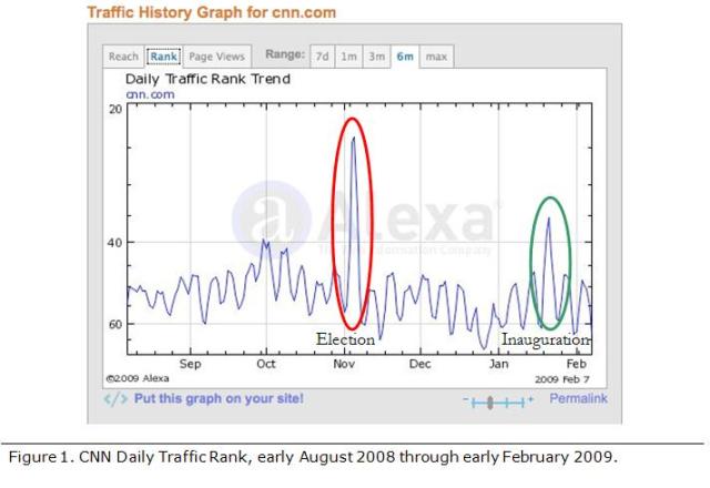
I now had to select a time period that would reflect normal web traffic and usage. I did not want to collect data around January 20th, 2009, since this was the date of the inauguration of President Obama and I felt that there might otherwise be unusually high traffic to the online news services such as CNN, MSNBC, and Fox News. In looking at the traffic graph for CNN from Alexa, my assumption was correct, though there was not as large a spike in traffic as there was around Election Day in November (Figure 1).
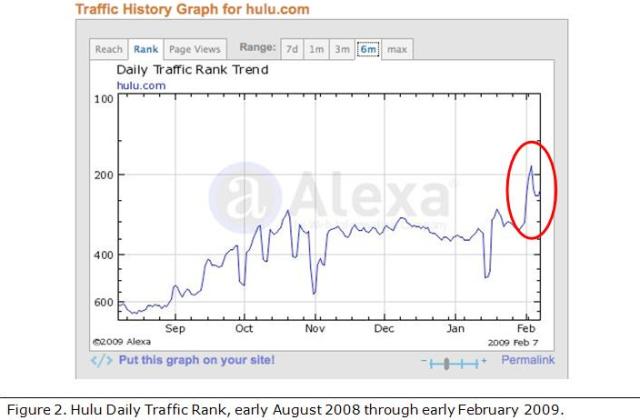
I selected the first week in February to conduct the survey. In selecting this week I forgot that February 1st, the first day of the survey, was also the day of the Superbowl. I was surprised to see no significant jumps in web traffic to news or sports sites; there was, however, a spike in the increase of traffic to Hulu, an online streaming video site (Figure 2). I learned later that Hulu had aired a humorous commercial during the Superbowl with Alec Baldwin posing as a member of an alien race sucking the mushy brains out of humans watching streaming videos on Hulu. While Hulu’s traffic had been climbing for the previous six months, the spike in their web traffic can be correlated to the Superbowl ad. For me, this spike in traffic just re-affirmed the use of Alexa to collect the web traffic data.
Survey Methodology & Data Collection
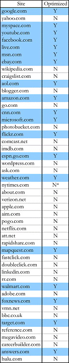
The methodology used for the survey was quantitative in nature. Across the span of the week of the survey I collected web traffic ranking data for each of the top 53 US sites in order to measure day-to-day fluctuations in web traffic and to see whether there was any significant increase or decrease in web traffic for any given site. At the end of the survey I then compared the top 49 US sites from the date of the start of the survey (February 1st) and the date of the end of the survey (February 7th). Four of the top 53 sites provide content that is adult in nature; therefore I excluded them from the survey, reducing the number of sites analyzed to 49. I would like to note, however, that I did visit these adult content sites on the iPod Touch, and three out of the four had optimized content for mobile computing devices.
The daily web traffic as indicated in table 1 was not just limited to US traffic—it reflects worldwide traffic figures. These figures account for the apparent discrepancy between US and worldwide traffic ranking, such as live.com (Microsoft’s Internet portal) and youtube.com (video streaming site) switching places during the week of the survey but not changing rank status when looking at only the US data set. The worldwide traffic ranking also explains missing numbers and sites, for example there is no site with a web traffic ranking of 10—this is most likely the result of the site being a foreign site; such as Amazon UK (or France or Germany), or one of the foreign Google sites such as google.uk.
Table 1 lists the data from the survey. The first column is the US web traffic three-month average ranking for the corresponding site in the second column. The next seven column pairs reflect the ranking of the web site based upon worldwide traffic. A quick glance will show some variation in traffic rankings. Again, some sites are missing from the data set due to the lack of correlation between worldwide visitors and US-only visitors.
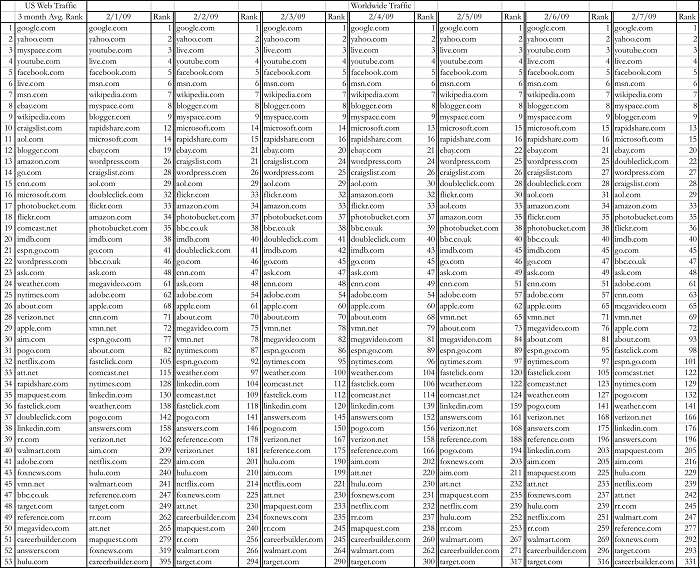
Table 2 lists the top 49 US sites at the start and end dates of the survey along with change in ranking by web traffic. Of the sites listed there were no change in ranking among the top 22 sites. With the remaining 31 sites, there were ranking changes as much as ± 4 positions; of these sites, doubleclick.com (an online advertising site) and hulu.com (online streaming video site) each shifted their ranking upwards by four positions—37 to 33 for doubleclick.com and 53 to 49 for hulu.com—by the end of the survey. The biggest losers were rapidshare.com (an online file sharing site) and megavideo.com (another online streaming video site); each site dropped three positions, from 34 to 37 for rapidshare.com and from 50 to 53 for megavideo.com.
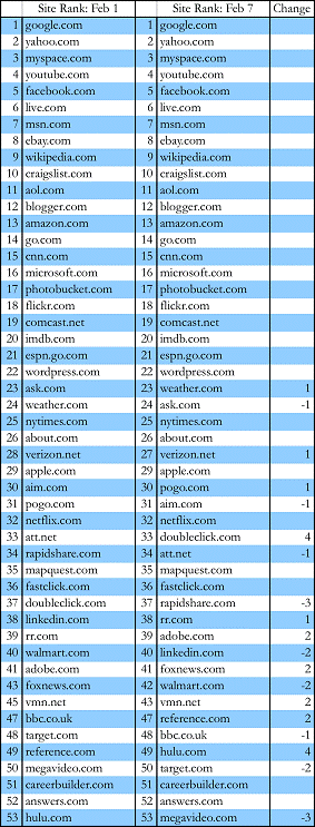
Table 3 reflects the list of the 49 sites that were visited with the iPod Touch and notes whether the sites were optimized for mobile content or not. Of the 49 sites, 19 (39%) were optimized for mobile content—these sites are shaded in the table. Notice that the nytimes.com site has an asterisk next to it; while the web site itself is not optimized for mobile content, there is a free NY Times application available from Apple’s iPod Touch/iPhone App store that will deliver optimized mobile content from the NY Times web site.
Selection of Sites for Analysis
Of the 49 sites extracted from the survey, I selected eight sites to analyze. I selected those sites that I felt represent the best—and the worst—of content that might be delivered to a mobile device. I also selected sites that I thought the mobile user might access. Three of the sites, google.com (Internet search engine), flickr.com (online photo hosting site), and walmart.com (commerce) optimized content for mobile users. These sites were selected based in part on their ranking but also from the services that they provide. Google is perhaps the Internet search engine of choice by users and often the first stop by a user looking for information on the Internet. Flickr, an online photo-hosting site, allows users to upload their own photos and organize virtual photo albums. Walmart, while not in the top 22 sites, has a very large presence in the US economy and retail sales. All of these sites were excellent in their usability.
The three sites I selected that were marginal in their usability are wikipedia.org (online knowledge base), wordpress.com (blog content provider), and the nytimes.com (online version of the NY Times newspaper). For many people Wikipedia is the second stop after Google when trying to find information on topics from the Internet. Wordpress provides blogging software as well as being a blog hosting provider; while probably not as large as Blogger or LiveJournal, Wordpress is considered to be one of the better blogging software developers. The NY Times online site is a source of news for many people.
The two sites I selected that failed in usability in the mobile environment are craigslist.com (online bulletin board site) and imdb.com (online movie database). Craigslist is probably one of the easiest sites to code, being little more than tables with links, yet even a simple design can break down in a mobile environment. The Internet Movie DataBase (IMDB) is an online repository for movie and actor/actress information. The complexity of this site, while it works on a large display, turns into a mush of images and impossible-to-read text in the mobile environment.
Analysis of Sites
Williams’ Visual Guidelines
Web sites, even those that contain primarily text, provide content through a visual medium. Therefore, any analysis of web sites should be through established guidelines on how to best present the visual content of web sites. In his 1999 article, Williams established a series of visual guidelines that can be used to analyze how well web sites display their visual information within the mobile computing display.
Williams’ visual guidelines provide a baseline by which I was able to analyze the selected sites from the survey on the iPod Touch. The visual guidelines that Williams presents are principles of good web design and should be applied when designing and analyzing content for the mobile environment where the visual component is far more consequential for navigation and understanding the context of the site. My analysis is qualitative in nature, based upon my experience in visiting the sites in a mobile environment—the library at New Mexico Tech was selected because it has a strong Wi-Fi signal.
Williams’ guidelines are divided into six categories. Of these six, five will be used to analyze the selected sites. The five guidelines that will be used are: element legibility, designing display elements, type legibility, pictures and illustrations, and icons. The sixth guideline, animation, will not be used due to the fact that few mobile computing devices support animation outside of games. The iPod Touch does not support the Adobe Flash format that is the standard for delivering rich animated content and video files on the Internet. The site hulu.com, for example, will load on the iPod Touch but the video content will not stream because the Flash format is unsupported.
Williams elaborates on his guidelines as follows:
Element legibility: size and contrast. For an element to be legible—“capable of being both apprehended and deciphered”(393)—it has to be large enough to be clearly seen as well as being able to tell what the elements are. For example, can the elements that make up a navigation bar be easily identified? Is the navigation bar itself identifiable? Do the visual elements have sufficient separation from the background or do they blend into the background because it is too busy?
Designing display elements: information structure, grouping, relative importance, consistency and predictability, and sequence. All of these elements can be grouped into the nomenclature of PARC: proximity, alignment, repetition, and contrast, although Williams moves contrast into the first guideline of element legibility. Elements of the display need to reflect a “pattern of logical or functional relationships”(393). Like items should be grouped together or identified by the use of white space. Similar elements or a group of elements should be organized through the use of “color, position, size, isolation, complexity, and tonal contrast”(394), have a consistent use of design elements, and have them in some form of order or sequence.
Type legibility: typeface choice, type size, bold and italic, all caps, alignment, line length, leading, paragraph boundaries, and headings. Is the typeface sans serif and large enough to be easily read? Avoid overuse of bold and italicized words. Don’t use all capitals letters, for “(W)ord shapes provide significant clues to the reader as to their identity”(394). Use flush-left ragged-right alignment for extended reading, keep line length between 40 and 60 characters, and have extra space (leading) between lines of type—“typically between 50 and 100 percent of the type size”(394). Paragraphs should be marked by boundaries of white space for visual chunking of data. Headings and subheadings should be used to organize and identify relationships and hierarchy.
Pictures and illustrations: decorative, supplemental text, information structure, and appearance and perceptual qualities. Pictures and illustrations should reinforce content; therefore avoid the use of pictures and illustrations for decoration. Provide supplemental text to ensure that the picture or illustration is interpreted correctly. Pictures should be used to “reveal the structure or organization of things or ideas—particularly when the structure is not linear”(394). Lastly, photos and illustrations should be used to show how something looks or to “depict a perceptual quality such as color, texture, pattern, shape, relative size, spatial location, orientation, arrangement, or appearance”(394).
Icons: labels, familiarity, and “global” differences. Icons should be labeled and conventional icons “whose use and meaning the user is already likely to be familiar with”(394) should be used such as the home icon to go to the home page of the site, an envelope for an email link, and a question mark for further help. Icons should be designed to be similar to each other in style and color, yet significantly different from other visual elements on the site in order to call attention to themselves as some unique element of the site.
Results of Analysis of Selected Sites
Table 4, which follows the detailed analysis of the selected sites from the survey, presents the analysis of all 49 sites of the survey. For each of the five guidelines—element legibility, design elements, type legibility, pictures and illustrations, and icons—I assigned a color value of green, yellow, or red. Green means that I was able to easily identify visual elements such as navigation, search, login and password fields; that the overall design was coherent, had a structure and understandable; that I could easily read the text on the display; pictures and illustrations were easily visible and understandable within the context of the content; and the use of icons were clear. Yellow means degradation in viewing the elements that could be corrected by using the magnification capacity of the iPod Touch to expand the site in the display. Red means that the site is unusable without significant magnification, which leads to a loss of navigational awareness of where you are on the site. The increased magnification means that additional scrolling in both vertical and horizontal axes is needed to navigate around the page.
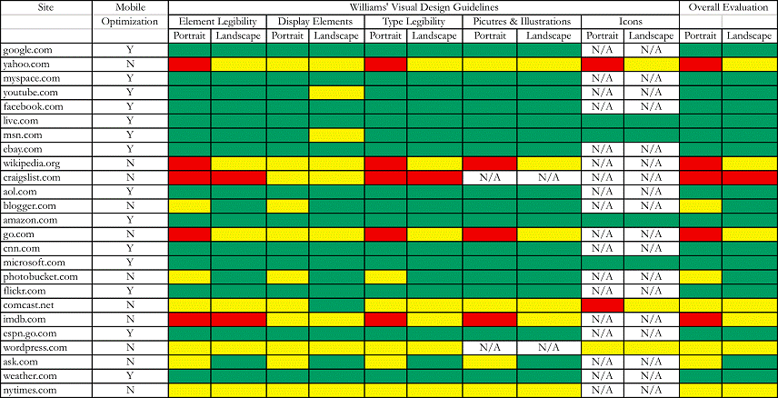
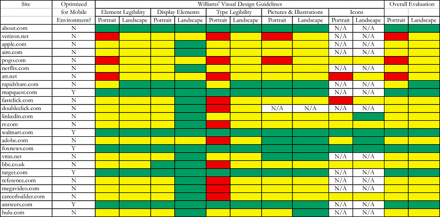
For each guideline there is also a Portrait and Landscape orientation qualifier. The iPod Touch has the ability to display a web site in either portrait orientation (320 pixels horizontally by 480 pixels vertically) or landscape orientation (480 pixels horizontally by 320 pixels vertically). I selected the portrait orientation as my default in that the majority of web sites are designed along the vertical axis rather than horizontal. Another reason for selecting portrait orientation as the default is that some sites, when detecting mobile browsers, will alter the content to be displayed in a single vertical column thus limiting the scrolling to only vertical. There are also web sites that will accept a URL and reorganize the content into a single vertical column that will then be sent to the mobile browser. Google has a subdirectory at www.google.com/gwt/n that will perform this function and a web site called Bare Site (www.baresite.com) will also reformat content from a given URL for mobile browsers.
The landscape orientation on the iPod Touch has the added benefit of magnifying the displayed site by 50% due to the number of pixels changing from 320 to 480. The drawback is that the display is now wider than it is vertical, resulting in the possibility of having to perform more scrolling on the vertical axis in order to get to desired information. When translated from portrait to landscape orientation most sites increased in usability to some extent. Some sites like the mobile site for Walmart, however, became marginally less usable; these sites are optimized for a portrait-oriented browser display and the content breaks down when the orientation is in landscape.
In the selected sites that I analyzed, I went no deeper into the site that the initial or home, page, which appears when the site is loaded into the browser. Because of the varied nature of the sites that I visited, there would be far too much diversity to draw any kind of coherent conclusion had I gone deeper into the sites beyond the home page. I had two options available for the site survey: a broad survey that looked at a lot of different types of sites but by necessity was shallow in that only the home page would be analyzed, or a narrow survey that looked only at a few sites but went deep into the site beyond the home page. I opted for the broad but shallow survey in order to look at as many sites as possible, across multiple genres, and sites that were optimized for the mobile environment.
Google.com
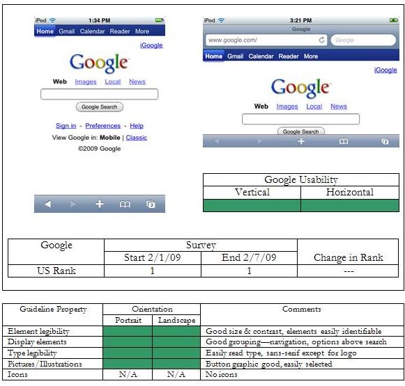
Google is, first and foremost, a search engine, though Google is rapidly becoming a web portal such as Yahoo! and AOL. Google recognized that I was using a mobile browser and provided mobile content with the option of loading up the "Classic" Google page. The search box in either orientation is readily accessible to the user. At the top of the page there is navigation that takes you to several of Google’s online functions of Gmail, Google Calendar, and Google Reader. There is a link in the upper right that takes you to your personal iGoogle account. In either orientation, Google is extremely useable.
In landscape orientation the navigation at top is slightly easier to read. While the content below the "Google Search" button isn’t visible, the primary elements for the site—the search box and the button—are visible along with the options of "Web," "Images," "Local," and "News." The iGoogle link remains in the upper right corner.
Flickr.com
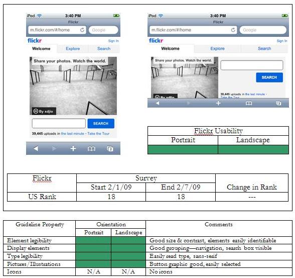
Flickr is an online image hosting site that optimizes its content for the mobile environment. As can be seen in the screen capture, roughly 50% of the available space is taken up by a randomly selected image. The remaining space is used for navigation—"Welcome," "Explore," and "Search"—along with a search field at the bottom of the image. In the upper right hand side there is the link "Sign In" that will bring up a username and password page. The background is clean with no clutter, I can easily differentiate the navigation choices and enter text in the search field and press the blue "Search" button.
In landscape orientation the site is still exceedingly usable. The image still takes up about 50% of the display. The search field and button, placed below the image in portrait orientation, now occupy the right-hand side of the screen. The navigation has expanded to fill the available space, becoming larger and easier to select for larger fingers. The majority of content is visible, requiring very little scrolling in the vertical axis to see the rest of the page.
Walmart.com
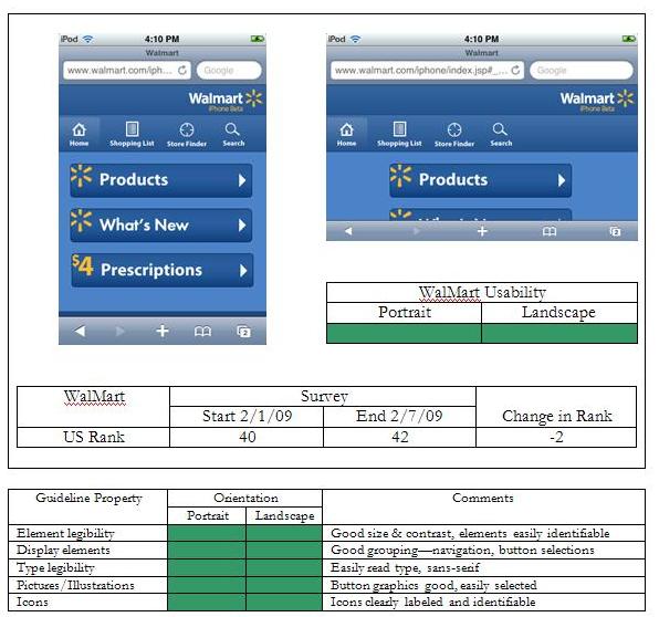
Walmart, America’s largest retailer, has an excellent mobile presence. The site is a model of simplicity with its color scheme—four shades of blue, white, and yellow. The user is presented with seven selections, three that are large buttons that take up roughly 2/3rds of the screen space, and four icons that are clearly labeled "Home," "Shopping List," "Store Locator," and "Search." The three buttons—"Products," "What’s New," and "$4 Prescriptions"—take the user into the site based upon pre-determined categories.
In landscape orientation the site is slightly less usable, the user having to scroll in the vertical axis in order to view the ‘What’s New’ and ‘$4 Prescription’ buttons. For people on the go, the option of finding a store through the ‘Store Locator’ icon is of great use, especially if you’re traveling in a new city and need to do some last minute shopping.
Wikipedia.org
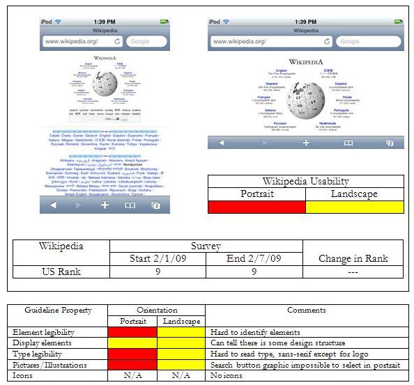
Wikipedia does have its detractors, and rightly so. While the idea of an online knowledge base that anyone can add to is attractive, people like Stephen Colbert have proven that the system can be gamed. Still, aside from Google, Wikipedia is probably the starting point for finding information, and it can be a valuable starting point. Unfortunately for the mobile user, they would be better served accessing Wikipedia from a desktop or laptop environment. In portrait orientation all of the possible links are far too small to be easily read or selected. The search box, located just above the middle of the page, is too small for easy text entry. The design is clean in that the background is uncluttered, but that is the only positive thing that can be said.
In landscape orientation the site fares just a little better. While the content from the search box and below can’t be accessed without scrolling at least now I can read and click the "English" option in the upper left of the circle of links. Without using the magnification capacity of the iPod Touch, Wikipedia is essentially unusable for the mobile user.
Wordpress.com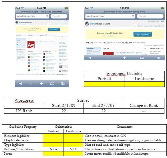
Wordpress is both a blog hosting site and a provider of open source blogging software. Unlike Wikipedia, though, in portrait orientation I can at least make out the structural design of the site. (Virtually all sites got green reviews for the display elements in both orientations.) I can tell that there is a navigation menu on the upper right side above the pale yellow box with the "Sign Up Now!” button that is nicely contrasting. I can tell that the light blue box on the left hand side is probably a username and password login fields. I can even tell that there is content on the right side in the form of blue words that are probably links, and content in the middle with icons of some form.
In landscape orientation a good chunk of the content is below the bottom of the screen, resulting in the need to scroll. The navigation is larger but still a little hard to read without further magnification. The "Sign Up Now!" button is clearly visible and easy to read, as is the content directly below the pale box with the number of bloggers, posts, and words. It is quite possible that the blogs themselves might be easy to view, or they may be impossible to access for the mobile user.
NYTimes.com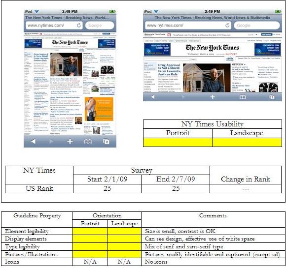
The mobile user can still access the NY Times website, and will be greeted with what can argued as information overload. Again, while there is some organization with the display elements—I can clearly see what appears to be a menu on the left hand side, areas of content separated by white space, and several images with, I hope, associated text (other than for the possible ad in orange about two-thirds of the way down the right hand side)—there is a lot of information being thrown at the user that can’t be readily identified without magnification.
Even in landscape orientation the site isn’t much better. I can make out that there is a navigation menu on the left side (breaking the canard of 7±2 menu items) and the headline of the top article. It almost looks like the designers of the nytimes.com site took the five-column layout of the paper and translated it directly to the web without consideration of the difference in the medium. Without significant magnification, the site isn’t usable, and then the user is faced with the spatial disorientation that is inherent with mobile devices.
Craigslist.com
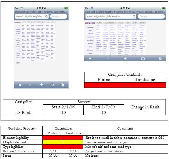
Craigslist is the modern equivalent of the old online bulletin board systems. It is simple in design, almost rather plain with a monochromatic color scheme. It is nothing much more than a simple HTML table, really. And it is completely unusable for the mobile user. Yes, there is a design structure visible, and that is really all it has going for it. Even in landscape orientation the text and links are too small to be easily read or selected. I have heard in passing that the founder of Craigslist was rather happy with the design, wanting to keep it simple while concentrating on the content and the online community. This is fine, but in some respects it wouldn’t take much to make Craigslist mobile friendly.
IMDb.com
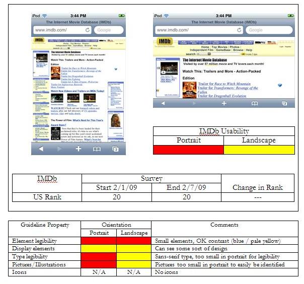
The Internet Movie Database (IMDb) is an online repository for just about everything movie-related: movie reviews, synopsis, actors/actresses, directors and producers, even movie trailers and still images. Everything a movie buff can ask for—except mobile usability. Design elements can be made out in portrait orientation, but just what they are is hard to tell. A navigation bar can be seen across the top of the page, and what appears to be secondary navigation down the left hand side of the screen. The links are hard to read and select. There is other content down the right hand side of the page, perhaps an ad of some sort (lower right).
In landscape orientation the site fares a little better. I can now discern that the navigation bar has elements—what they are, I don’t know without further magnification. I can also easily see and read the top most links, which are links to trailers for several upcoming movies. The green diamond to the right of the links indicates a site element that is unsupported by the mobile Safari browser, probably Flash content of some kind.
Conclusions
Designing for the mobile environment is similar to designing in the early days of the Internet when monitor resolution was small and the available color palette was limited, especially if you wanted to make sure that the colors were correct across multiple platforms. Design for mobile web doesn't have to be ineffective or inelegant. Special considerations, however, have to be made when addressing the concern of the mobile user.
From the survey I was able to determine the following common threads for those sites that delivered content that was optimized for the mobile environment.
Browser detection. The optimized sites detected that I was using a mobile browser and delivered content that was specifically designed for this environment. Browser detection scripts are not new; it is common to use Javascript within the <head> section of a web site to detect whether the browser is Internet Explorer and, if so, to use a known "hack" to get Internet Explorer to render the cascading style sheet box model correctly. The sites that used browser detection redirected me to a subdirectory of the main web site that provided mobile content. The use of browser detection in order to provide targeted content should be considered as a mandatory step in order to optimize content for mobile browsers. An alternative is to maintain a secondary web site with the .mobi extension and, upon detection of a mobile browser, automatically redirect the browser to this secondary web site. (The .mobi top-level domain was created by the Internet Corporation for Assigned Names and Numbers (ICANN)).
Think small and simple. The optimized sites had minimal content for the mobile environment. Google, for example, had a navigation bar across the top with four options and the ubiquitous search box in the center of the mobile page. CNN and Fox News made minimal use of images—CNN had scaled images—with illustrations being small and monochromatic and the news headlines were short and scanable. Walmart used a clean color scheme with only three basic colors: blue, yellow, and white. Microsoft used icons to effectively identify their product line with linked options that were easily selectable. The needs of the mobile user demand that the content be specific, clear, and identifiable. Even without Walmart labeling the icons of the mobile site I suspect that the majority of users would understand their meaning—perhaps the only one that would be confusing would be the store locator that resembled a location icon. On top of Amazon’s mobile site there is an icon of a shopping cart—a metaphor that online shoppers instantly understand: this area is where I have stored things that I probably want to buy.
Device-specific design. An option for delivering web content to an Apple iPod Touch or iPhone is to design an application, or "app," for this device. Apple provides a free software development kit (SDK) for the iPod Touch / iPhone and encourages third parties to develop and market applications from the Apple iTunes App store. For example, there is a NY Times app that downloads content from the nytimes.com web site and that is formatted for the iPod Touch / iPhone display.
The May 2009 issue of Mac|Life has an article about designing web content for the iPod Touch / iPhone called, appropriately enough, “How to iPhone-ize Your Website.” The author Mike Lee deals with particular issues about designing for the iPod Touch / iPhone such as the design interface: “There are also interface differences, given the use of finger taps instead of mouse clicks. Controls must be large enough—and far enough apart—to be tapped by a finger. And because there’s no cursor, hover styles and mouse-over events will happen in unexpected ways, if at all” (48). I discovered this last feature when viewing a page from my work web site where I use a cascading style sheet that incorporates a hover style to hide or display lists as drop-down menus. While this works just fine in a normal web browser with a cursor and mouse clicks, with the Safari Mobile browser this page did not work at all.
Still, designing an app for the iPod Touch/iPhone platform needs to adhere to good design principles. It is possible to design content for the mobile computing environment; my survey and analysis has proven such. I was pleasantly surprised to see that nearly half of the web sites that I surveyed delivered content that was optimized for the mobile environment. It is also obvious from my survey that sites that are not optimized for the mobile environment almost universally fail at some degree in providing context relevant content. Some are marginally usable, such as the nytimes.com web site while others, such as craigslist.com, are not usable at all.
In his book Mobile Web Design, Cameron Moll tackles the issue of designing content for the mobile environment. While other books focus on designing for a single platform, such as software development for the iPhone, Moll’s book presents a clear overview on the issues inherent with the mobile environment and addresses the resolution of these issues across a variety of mobile platforms. On pages 31-42 he summarizes four options the designer can take and evaluates the pros and cons for each option. The first option is to do nothing, or as Moll says “Summon the WAP gods and pray the site renders well” (32). The idea here is that the browsers on the most recent generation of mobile computing devices are “fairly adept at repurposing sites on the fly to fit the smaller width of mobile screens”(33). The mobile browser reformats the content into a single column and images are reduced and optimized for the display. The same content that is provided to the desktop environment is provided to the mobile environment. Moll notes that while this means that the designer doesn’t have to optimize the design for the mobile environment, “Doing nothing does nothing to address the contextual relevance of mobility, nor does it exploit the unique abilities of mobility” (34).
Moll’s second option is to “reduce images and styling” in order to create “raw, minimally styled content” (35). Here he advocates using sites such as Bare Site and Google’s site extraction web site to strip the content from a site and present it in the format that the mobile browser defaults to, that of a single column display with scrolling along the vertical axis. Moll acknowledges that this option “ignores the contextual relevance of mobility” and that the file size of the stripped down site can still be large if there is a lot of content (36).
The third option that Moll advances is to use a subset of cascading style sheets (CSS) that is targeted specifically for mobile devices. This CSS uses the media=“handheld” attribute in order to load a set of CSS instructions that would be applied in a mobile environment. Moll once again acknowledges that using handheld CSS instructions “ignores the contextual relevance of mobility” and admits that as of right now the media=“handheld” attribute is inconsistent in its support and is unreliable (38).
Moll’s fourth and final option is to design content for a mobile device. Here he states that designing content targeted for a mobile device is “contextually relevant—addresses first how content is consumed, second what it looks like” (41). Mobile content can be stripped down to the bare essentials that result in the use of less bandwidth and provide the user with a faster browsing experience—Moll reminds us that most users pay per kilobyte of data downloaded. The drawbacks to designing content for mobile devices is that the designer has to make assumptions about the mobile device and browser that in turn might dictate what content to provide. There is also a duplication of effort in that two sets of files have to be maintained, one for the desktop / laptop environment and one for the mobile environment. And alternate URLs will be needed which places the burden on the user to try to remember the mobile URL for any given site.
In his conclusion Moll advises the pursuit of either option one (to do nothing and hope that the site will render acceptably well) or option four and specifically design for the mobile browser. From the survey and analysis that I have performed, it is obvious that the content for sites that have been optimized for the mobile computing environment—Moll’s option four—does not break down, or lose contextual relevance—when displayed within the mobile computing environment. Content for sites that have not been optimized—Moll’s option one—vary in usability but, in general, there is a loss of contextual relevance and the site is unusable without a significant amount of magnification that can result in a loss of navigational awareness. The result of the magnification translates into additional scrolling along both the vertical and horizontal axes in order to situate where you are spatially on the page. You might have to reduce the screen magnification until you see most or the entire page again before being able to use the page.
The W3C maintains a Mobile Web Initiative (www.w3.org/Mobile/) and from this page there is a link to a downloadable PDF file (www.w3.org/2007/02/mwbp_flip_cards.pdf) that is a series of flip cards containing 60 guidelines that summarize the guidelines from W3C’s Mobile Web Best Practices 1.0 (www.w3.org/TR/mobile-bp/). Anyone who is thinking about designing mobile web content should become familiar with the Mobile Web Best Practices guidelines provided by W3C and should download and print out the PDF file as a handy reference. Many of these guidelines reinforce what we as technical communicators learn in designing web content, while some are targeted directly for mobile web content. The following three sets of guidelines come directly from the W3C Mobile Best Practices flip cards.
Optimize navigation.
- Navbar: Provide only minimal navigation at the top of the page.
- Navigation: Provide consistent navigation mechanisms.
- URIS: Keep the URIs of site entry points short. (URI: Uniform Resource Identifier)
- Balance: Take into account the trade-off between having too many links on a page and asking the user to follow too many links to reach what they are looking for.
Use the network sparingly.
- Auto refresh: Do not create periodically auto-refreshing pages, unless you have informed the user and provided a means of stopping it.
- Redirection: Do not use markup to redirect pages automatically. Instead, configure the server to perform redirects by means of HTTP 3xx codes.
- External Resources: Keep the number of externally linked resources to a minimum.
- Caching: Provide caching information in HTTP responses.
Think of users on the go.
- Page title: Provide a short but descriptive page title.
- Clarity: Use clear and simple language.
- Central Meaning: Ensure that material that is central to the meaning of the page precedes material that is not.
- Limited: Limit content to what the user has requested.
- Suitable: Ensure that content is suitable for use in a mobile context.
- Page Size Usable: Divide pages into usable but limited size portions.
Suggestions for Further Research
My research can be used as a starting point for future scholars in their research into the delivery of content within the mobile environment. One area of research would be to take the sites from the survey that I found unusable and redesign them specifically for the mobile user. Sites such as Craigslist and Wikipedia, for example, could be designed for the mobile user. Craigslist could take advantage of the built-in positioning that mobile devices come with and provide content that is targeted for the location of the user. Wikipedia could use Google’s mobile page as a model and provide a simple front-end that is little more than a search field with a submission button. Once the sites have been redesigned then an evaluation should be conducted on how improved the usability of the redesigned site is within the mobile environment.
Another area of research would be to perform another survey and analysis several years from now to see if more sites have recognized and altered content delivery for the mobile user. Examples here would be the web portal sites such as Yahoo!, Time Warner’s rr.com and others. These sites are content-heavy and while usable on a desktop or laptop environment, they are almost currently impossible to use in the mobile environment. These could be redesigned similar to CNN’s mobile site to deliver current news or weather with a login and password field. Once inside, the user could then use current Web 2.0 practices to organize the content to how they would like to see it displayed.
A survey could be performed, this one deep rather than shallow. A comparison could be made against web sites of a selected genre, such as news sites, entertainment sites, or shopping sites in how content is delivered to a mobile device. Does the content lose context once past the initial home page of the site? How easy is it to perform online shopping on a mobile device from Amazon, WalMart, and Target? Once Flash is supported, how good is the streaming video and audio quality? Are there significant signal dropouts as the user is handed off from one cell to another while watching the latest episode of House from Hulu?
Final ThoughtsThe role of the technical communicator is that of performing and facilitating knowledge transfer. Our tools are as varied as the mediums that we use in order to attain this transfer. When the audience is left without the knowledge that we wished to impart, then we have failed in our task as communicators. This should never be the case. Regardless of the medium, we should always be able to ensure that the audience can understand the content, no matter their environment. Through effective design, content can be understood.
As my research has shown, content does not have to lose relevance when presented on a mobile computing device, so long as good design principles are followed. The technical communicator should look at designing for the mobile computing environment as a motivational challenge, for arguably it is one of the hardest environments to design for, and can validate the designer's skill as a communicator.
Works Cited
Albers, Michael and Loel Kim. “Information Design for the Small Screen Interface: An Overview of Web Design Issues for Personal Digital Assistants.” Technical Communication 49.1(February 2002): 45–60.
Baudisch, Patrick, et al. “Collapse-To-Zoom: Viewing Web Pages on Small Screen Devices by Interactively Removing Irrelevant Content.” Proceedings of the 17th Annual ACM Symposium on UIST, October 24–27, 2004: Symposium on User Interface Software and Technology. ACM: New York, 2004. 91–94.
Buyukkokten, Orkut, et al. “Power Browser: Efficient Web Browsing for PDAs.” Proceedings of the SIGCHI Conference on Human Factors in Computing Systems. CHI Letters 2.1 (2000): 430–437.
Chu, Steve. “The Possibilities Are Wireless: Designing and Delivering Information in the Wireless Space.” Technical Communication 48.1 (February 2001): 49–58.
Farkas, David K. and Jean B. Farkas. “Guidelines for Designing Web Navigation.” Technical Communication Third Quarter (2000): 341–358.
Franklin, Curt and Julia Layton. “How Bluetooth Works.” How Stuff Works. 18 Feb 2009 <http://electronics.howstuffworks.com/bluetooth>
Hattori, Gen, et al. “Robust Web Page Segmentation for Mobile Terminal Using Content-Distances and Page Layout Information.” Proceedings of the 16th International Conference on WWW, May 8–12: Pervasive Web and Mobility. ACM: 2007. 361–370.
Lam, Heidi and Patrick Baudisch. “Summary Thumbnails: Readable Overviews for Small Screen Web Browsers.” CHI 2005: Technology, Safety, Community: Conference Proceedings Conference on Human Factors in Computing Systems, April 2–7. ACM: 2005. 681–690.
Lee, Mike. “How to iPhone-ize Your Website.” Mac|Life. May 2009: 47-53.
Mallick, Martyn. Mobile and Wireless Design Essentials. Indianapolis: Wiley Publishing, Inc, 2003.
Moll, Cameron. Mobile Web Design. Salt Lake City: Self-published, 2008.
Spyridakis, Jan. “Guidelines for Authoring Comprehensible Web Pages and Evaluating Their Success.” Technical Communication Third Quarter (2000): 359–382.
“WAP Basics.” w3schools.com. 28 Mar 2009. <http://www.w3schools.com/wap/wap-basic.asp>
Williams, Thomas R. “Guidelines for Designing and Evaluating the Display of Information on the Web.” Technical Communication Third Quarter (2000): 383–396.
Wobbrock, Jacob, et al. “WebThumb: Interaction Techniques for Small-Screen Browsers.” Proceedings of the 15th Annual ACM Symposium on UIST, October 27–30: Symposium on
User Interface Software and Technology. ACM: New York, 2002. 205–208.